


LEARNING TO WRITE IS LIKE...

Learning to write is like trying to become fluent in Japanese solely by reading untranslated manga. You have no idea whether you're learning Japanese or making up your own language entirely. Ultimately, it's a little of both.
REVIEW - ALIMIGHTY Original Graphic Novel ( OGN )
Almighty OGN
Review by Dave Baxter, posted February 25, 2008

Pencils: Edward Laroche
Inks: Edward Laroche
Price: $10.00
Publisher: Edward Laroche
David Lapham and Eduardo Risso team up for a gorgeous new OGN, a fast-paced, action-oriented, sci-fi chase across a post-apocalyptic wasteland.
Oh…wait…no they don’t.
So…who made this thing? Edward…Laroche? Okay, well, what publisher? Edward…Laroche ?!? So, no company, just him, all on his own, a full 180-page OGN, stylish, slick, pro production values indistinguishable from any Oni or Viper Comics collection, but he just…made it? And…uh…printed it?
Yup: and he doesn’t even pretend he’s a “company”, but instead just puts out his first published work, Almighty, a book that follows a hired killer and the young girl she’s hired to save, and protect from an onslaught of other killers. “Fale” is this savior-warrior-woman’s name, a person of questionable origins, apparently having been raised inside “Zone 1”, a place where only the most impossible mutations of post-nuclear holocaust reside. Armed with abilities perhaps biological, perhaps cybernetic, she carries her young charge across miles of dangerous road, an ensemble of mad kidnappers at their heels, mercenaries, mutants, and more at their toes.

Almighty is a sweetly conceived first offering from Laroche, self-contained and wholly its own, yet set in a fully-realized future world, one that looks to be revisited and fleshed-out in upcoming sequels, starting with Remember Amphion (for which there’s a one-page preview ad in the back). Even better, Fale (the killer-for-hire) seems to be Laroche’s “heroine”, his protagonist, Remember Amphion being a book that appears to peer into her past, and so I’m assuming she’ll likely continue as the focus for the many books to come. Which is a good thing: Fale rocks ass.
Comics could use a few more strong, well-established female heroes, even if they are, more often than not, anti-heroes or femme fatales, and Fale, while not really much of a pure-bred heroine, swiftly proves a fascinating lead, complicated and yet simple-minded and therefore focused in her own way. Her past is tied to the unique aspects that make Laroche’s post-apocalyptic world worthwhile, and not just a rehash of a zillion other similar After-the-Fall clichés, but rather its own distinctive setting. She’s a matchless foil to the world’s amoral side, and a character whose dichotomies allow her to become more than just a hero in an otherwise self-serving future. Instead, she’s one of them, through-and-through, and yet she’s more, but only just, which is where the entertainment comes in.
Fale is good at what she does, but not unconquerable, and there’s plenty of others with the exact same qualifications as she, superior beings all. In Laroche’s world, Fale is literally one of the best, but the total number of “bests” is pretty damn high. So the action is breakneck, the threat level extremely elevated, and the cool factor through the roof, and despite it all, Laroche never loses the thread of the story or the characters’ own arcs in favor of simple eye-candy. The story of Almighty is a straight-forward thing, and kicks right off with action and ends with the same, but there’s a lot of nuance packed in-between, and even during, marking the book a complete and total package.

Laroche’s art is, as I sort-of joked about up at the beginning there, very similar to Eduardo Risso’s, fluid and dynamic and utterly appealing. There’s traces of Jason Pearson, Brian Stelfreeze, and Phil Hester as well, though any which way you cut it what it equals is an extremely beautiful and high-quality graphic novel. The action is glorious and perfectly rendered, the quieter moments suffering not a jot in comparison to the fight scenes, and the presentation is obviously one schooled on the best that modern comics has to offer, as it manages to match them, panel for panel.
With writing somewhere between Lapham and Brian K. Vaughn (the cross country chase scenes and the talking-head scenes interspersed reminds me, in their execution and quality, entirely of Y: The Last Man) and art straight from popular Image or Vertigo books, Almighty becomes both the title and description of this thickset gem. Affordable, with a higher page count, and frankly better than most $20 GN’s popping up out of the mainstream and even the small presses, I really can’t recommend you spend your money on anything else. Laroche may not be a name, as this is his first, and it doesn’t yet have penny one behind it for marketing purposes, but there’s no possible way talent of this nature can go on in this secluded vein for long. I’ve rarely read anything so good from a purely self-published source before, and the last time I did, the book was picked up by Slave Labor Graphics within the year. So mark my words, and think of this as an advanced limited edition.
###
The only place to order Almighty for a meager $10 US is at Edward’s MySpace site: http://www.myspace.com/blackhalo51 Drop him a message and he’ll be sure to get a copy out to you. Preview pages are also available at the MySpace site.
REVIEW - LOCKE & KEY #1 (the son of Stephen King comes to comics!)
Locke & Key #1
Review by Dave Baxter, posted February 23, 2008

Pencils: Gabriel Rodriguez
Inks: Gabriel Rodriguez
Colors: Jay Fotos
Price: $3.99
Publisher: IDW Publishing
Novelist Joe Hill was born Joseph Hillstrom King, the second child to world-renowned authors Stephen and Tabitha King, and now, a mere year after the king of Kings brought his own property, The Dark Tower, over to mainstream comics to the praise of critics everywhere (well, except from me, but I digress…), his son joins IDW to produce Locke & Key, and this time, the “King” involved is operating as creator and full-on scripter. Following the success of his first horror novel, Heart-Shaped Box (named after the Nirvana song), Hill collaborates with co-creator and artist for the series, Gabriel Rodriguez, and what the duo put out is—come what may in later installments—the best first issue to a horror comic I have ever read.
What makes it so good? The story begins during a day in the life of the eponymous Locke family, on vacation in West Coast Country, USA, renovating their small rural estate. The comic itself opens with a serene full-page splash, depicting the front door to said estate, a large “Welcome” mat laid before it. A butterfly hovers beatifically over a small patch of wildflowers, the scene otherwise empty, a small brass knocker resting lifeless against the plain wood of the door. And then the horror begins.
Quietly, surreally, appearing as though a part of some other introductory scene, a thing made for some far less dreadful tale, Hill and Rodriguez masterfully hook readers through both cheeks with the gentlest of care. You hardly feel the pain. Moving between past and present then, a trick as old as time and yet utilized to awesome effect here, the creators give an eerie authenticity to the proceeding events. Whether sudden violence, heart-thumping tension, maudlin self-discovery, true mourning, offhand banter, or the beginnings of the epic side of the story, it all feels casual, everyday and genuine. Which makes it, frankly, all the more terrifying.
Hill seems a natural at visual storytelling, not just managing a fabulous flow but also using the very tricks allowed by comics to enhance his overall plot. The revelation of what’s shown versus what isn’t, and when, and even in what way—it’s all here. Nothing complicated, but very, very clever. And effective. Moreover, Hill manages to use visual cues to put honest personality into his characters, even within the course of a single introductory issue. The book focuses primarily on a singular and terrible event, and then its aftermath and the way in which the characters are moved into the positions the book needs them to be moved into. And yet it all seems natural, and without ever becoming dense or burdensome, packing a precise ratio of character, plot, and ingenuity into an unbelievably cohesive whole. The issue is so good, in fact, I’m nervous the follow-up can’t possibly match it.
Gabriel Rodriguez may be as much to blame for this expectation-raising beginning, and I’m inclined to believe he is. His layouts are superb, his composition pitch-perfect for every moment. There’s something inordinately appealing to Rodriguez’s character expressions, their postures, his take on action and scenes of dramatic impact. He never comes across as kitschy, though his style is indelibly that of a comic book: a rare nuance to achieve. The horror is gripping, the quieter scenes engrossing.

As I described the opening page in detail earlier, so now I’ll mention the book’s final page: it’s a mirror image, or rather, a through-the-looking-glass dark cousin thereof. And the point: the entire book is this carefully laid out. Every moment made just so, to correspond and fit with the moment that came before and the moment to come after, often panel-to-panel. Locke & Key #1 is one the most detailed and skillfully constructed—literally constructed—non-art-house comic books I’ve ever seen, and it should make everyone realize just what a horror comic can be, as opposed to a horror anything else. The best of the best, and practically a manual on how to write a good first issue to an ongoing series.
REVIEW - CEMETERY BLUES #2
Cemetery Blues #2 (ADVANCE)
Review by Dave Baxter, posted February 19, 2008

Pencils: Thomas Boatwright
Inks: Thomas Boatwright
Price: $3.50
Publisher: Image Comics/Shadowline Studios
Following an outbreak of vampirism, our not-at-all stalwart duo of Ridley and Falstaff stumble upon a funeral in the town of Hernesburg (mistaking the coffin’s occupant for an undead sort). Though while vampires seem in short supply, something else haunts the woods within the town’s surrounding hills, and before anyone can stick a cork into Ridley’s mouth, our heroes are recruited to lead the town’s menfolk on an ill-fated monster-hunting expedition. So into the woods they go, they go. A very powerful spirit attacks, many die, our heroes run and live to drink another pint, the origins of the enemy are divulged, and the duo’s arch-nemesis, the warlock Orlok, makes his move.

Whew! To say issue #2 of this wild-child story is cover-to-cover excitement would be an understatement. The humor by Ryan Rubio remains a naturally woven-in thing, the characters and events stitched into a smooth-textured whole. This book has been compared to Cemetery Man, and via that, that movie’s own influence: the Italian comic book Dylan Dog, though while the structure is undoubtedly the same (a slender rakish fellow with a stunted ugly fellow solving supernatural cases) the flavor and, most especially, its aftertaste, is due to a preparation all the creators’ own.
Cemetery Blues is far more coherent than any of its influences, and it also sticks to an unexpectedly epic underlying backstory. Like all great cartoons, there’s a core villain, the wicked and seemingly immortal Orlok, who is the architect behind all of Ridley and Falstaff’s woes. Each story is self-contained, and Haunting of Hernesburg is no exception, though little by little a grander scheme looks to unfold. Such centralized, classic high-drama is a fresh take on this type of quirky horror-humor varietal, and Rubio and artist Thomas Boatwright manage to plunge it smack into the center of their creative pool without losing a drop of water. All the humor remains, the eccentric movement to the scenes, the dry-wit dialogue, the situational farce, the actual, chilling and dangerous side to the horror itself. Everything’s here and looking better than it ever looked in either Cemetery Man or Dylan Dog.
With the introduction of the central threat to the Hernesburg story in this issue, everything  gets kicked up a notch, the action and the actual menace of the story superseding the humor to a degree (though it’s still here, and in spades). For anyone unconvinced by the first issue, it’ll be near impossible not to return for the third and final after this second act.
Boatwright continues to dazzle eyes everywhere with his magnificent, thickly realized black-and-white pages, all awash in the non-colored equivalent of actual watercolor. His abilities as a sequential storyteller are also equally superb, the characters and the moments never seeming rushed or slow and the timing of the humor never falling short, the body language and expression detailed and nuanced and pitch-perfect. This issue also sports Boatwright’s unquestionably best cover to date: I want this thing mural-ized on a wall. It’s frickin’ gorgeous.
So another awesome Cemetery Blues issue, go figure. Probably the most surprising thing that Shodowline’s yet picked up and produced, though no one who peeks inside and notes the quality of it will ever wonder why. One more issue to go in this current series, and I’m chomping at the bit to find out how it ends! A truly thrilling horror story, and an honestly funny comedy adventure. John Landis couldn’t have managed it better.
###
If you’d like to give the original self-published mini a shot, contact the creators via their website: http://www.sequentialmatinee.com/.
Issues #1 and #2 are available at ComiXpress, though the third and final has never officially been published, so drop Ryan and Thomas a line and they’ll be happy to get a copy of those out to you.
“The Haunting of Hernesburg” Issue #1 is available through Shadowline/Image, at all major comic shops nationwide. And check out the book’s preview at newsarama.
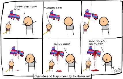
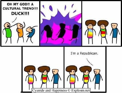
Cyanide & Happiness
Just found this new webstrip over on Explosm.net:
CYANIDE & HAPPINESS
It's quite funny. Here's some samples: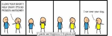
REVIEW - OLGA One Shot (Caruso Comics Considered, Part 3 of 3)
Olga One Shot (ADVANCE)
Review by Dave Baxter, posted February 18, 2008

Pencils: Simon Fernandes
Inks: Simon Fernandes
Price: $4.00
Publisher: Caruso Comics
An 18-year-old narrator relates his story, of an experience obviously life-affecting: a girl named Olga, a girl he hasn’t spoken to or seen in years, calls him up, out of the blue, and asks to get together. Being a shy and—other than a lackluster part of a local hockey team—introverted sort, the narrator agrees, somewhat excitedly but equally (naturally) confused. Olga soon reveals herself to be a desperate, near-suicidal case, having been recently rejected on the romantic front, and so she looks to this socially awkward boy to save her, somehow, and do so in the course of a single night.
To say that Olga, the comic, is exciting, would be a lie, but to say that it’s slow or boring would be the same. It is, without a doubt, an unhurried story. It takes place within a very constrained about of time (a single night) and so is allowed a heavily detailed, wonderfully molasses-slow movement, but this tends to heighten the suspense rather than obliterate it. What’s going to happen? What’s wrong with this girl Olga? What’s the narrator going to do? What’s going on?!? All these questions seem imperative when turning the pages of this latest one-shot by newcomer Dino Caruso.

The narrator remains unnamed throughout, which was probably a smart move on Dino’s part, as without the name the exact true-to-lifeness of the story remains uncertain. It smacks of autobiography, especially the truly poetic turns of events at the end, moments that seem so un-story-like and yet apt that they could only come from reality. The story is delightfully involved with its own weight, so much so that it also becomes self-conscious of its own weight, and ultimately manages a series of life-lessons that aren’t in the least bit preachy, because the lessons skirt the primary issues involved and instead comment upon core understandings of human thought and behavior that…well…they’re actually quite astute, and acute, and mean more and pertain to the story to a greater and heftier degree than what anything more directly preachy could have managed. Caruso intuitively pulls off a magical hat trick, allegorically speaking, showing readers a straight path only to offer an end moral that’s basically: “Space is curved, kid. There ain’t no straight lines, only relative ones.”
Simon Fernandes joins Caruso for Olga, an artist with a thick-lined, stunted-figure style most commonly seen in webstrips, animation, and underground comix, though he uses the aesthetic to great effect here. Under Fernandes’ depictions, the narrator appears sweetly self-contained in both touching and arrogant ways, as demands the story. Olga and the side-characters are also seen across a wide array of moments, each calling for a showmanship of expression most artists would be hard-pressed to achieve. In a way, Olga is Fernandes’ warm-up, a thing he’s very, very good at but not quite perfect for. Caruso and he have a new book coming soon called The Amazing Adventures of Bell Boy, wherein Fernandes begins to cultivate a style and slickness not seen since Mike Kunkel’s Herobear and the Kid. The previews of Bell Boy look genuinely attractive (check ‘em out and I dare you to disagree!).

So that wraps up “Round One” of Caruso Comics. Three very quality comics, two slice-of-life inspired, one a bit more wild and woolly and pulp-flavored. There’s also a baseball themed graphic novel titled Against the Wall (an early preview of which was reviewed on BF) and that’s technically the last of the “Round One” books, and then comes the very intriguing “Round Two’ers”: the aforesaid Bell Boy, Fisk: Substitute Hero, and Courage, all of them genre-flavored and therefore upping the excitement factor by a thousandfold or so. After Olga and Crossroads, and A Cautionary Tale, and the sincere skill they were all executed with, I honestly can’t wait.
###
For ordering copies of Olga or other Caruso Comics, go to http://www.carusocomics.blogspot.com/ and send Dino a message.
An official website (http://www.carusocomics.com/) is in the works, though it’s only a homepage for the moment (see date of this article above for an exact definition of “the moment”).
REVIEW - A CAUTIONARY TALE (Caruso Comics Considered, Part 2 of 3)
A Cautionary Tale One Shot (ADVANCE)
Review by Dave Baxter, posted February 17, 2008

Pencils: Paul Quinn
Inks: Paul Quinn
Price: $4.00
Publisher: Caruso Comics
Talk about classic: what comic reader doesn’t have a notebook or scrapbook chock-full of notes and scribblings, ideas and character concepts alongside the odd plot outline, all of which we may or may not have ever had honest intentions of pursuing, but which we love musing upon and keeping records of for posterity’s sake alone if nothing else? Dino Caruso, being a writer, is more involved with such a notebook than most, though he’s definitely preaching to the choir with A Cautionary Tale, and it’s a sermon the faithful ought to revel in.

A down-and-out narrator, drinking himself into a stupor in a local dive establishment, is coaxed into relating his tragic tale to a handsome young couple (who only half actually care, but hey, this disheveled stranger’s kind of aggressive, so let’s just let him talk…). So the story is told, a story about stories, about unrealized stories that are written down, recorded, hoarded, until the world, to the writer, becomes a threatening place. As time passes, the writer grows paranoid, obsessively so, and turns away from those once close to him. To make matters worse, he can’t bring himself to actually show anyone his work for fear of concept-theft. Will he lose everything before he comes to his senses and simply tries to be proactive about his writing career?
Ha! The joy of A Cautionary Tale is that it is indeed a cautionary tale - it simply isn’t that easy. Like the best Twilight Zone or Tales From the Crypt speculative horror short, Caruso’s Tale smacks readers upside the head, posing as a contemporary fable with a tail-end moral only to collapse into a fantastically vicious finale. The characters are stylishly written, the emotion realistically represented, the pacing attractive; it’s a captivating one-shot, made unforgettable by its clever leap away from any overly naïve, morally enlightening end (a thing that would have been easy to flow into). Caruso proved his steady-as-she-goes writerly chops with his Crossroads, but here he has a lot more fun, gets a touch more stylish, and showcases some unique qualities to his conceptual dexterity.
Artist Paul Quinn returns (also of Crossroads fame) and he, too, is allowed a greater level of artistry, moving from noir to slice-of-life to pulp and back again, as the story wills. His use of blacks is hence heavier and more versatile, his range of characters and actions equally so. He makes the book look like an authentic thing, from the very era its cover steals so liberally from (there’s irony for you, stealing from stories for a story about stealing stories), though the final product feels nicely modern nevertheless. Composition is strong throughout, and never once does the art feel less than mainstream professional.
A much more ambitious and therefore impressive offering than Crossroads, A Cautionary Tale goes a long way to convincing that Caruso is nothing like a one-trick pony, and that, whatever else he does, it’ll be well worth a gander. His style is classic while managing a certain fresh factor, or at least, it never struck me as stale or rote, and his taste in artists is impeccable. I’ve got one more book of his to peek at for now, Olga, which I’m going to hit up this weekend. After the last two…man…now I’m excited, but also, now I have expectations! Let’s see how he does….
###
For ordering copies of A Cautionary Tale or other Caruso Comics, go to http://www.carusocomics.blogspot.com/ and send Dino a message.
An official website (http://www.carusocomics.com/) is in the works, though it’s only a homepage for the moment (see date of this article above for an exact definition of “the moment”).
REVIEW - CROSSROADS One Shot (Caruso Comics Considered, Part 1 of 3)
Crossroads One Shot
Review by Dave Baxter, posted February 16, 2008

Pencils: Paul Quinn
Inks: Paul Quinn
Price: $4.00
Publisher: Caruso Comics
No one can accuse independent comic writers of shirking their own life material. There exist an equal (if not greater) number of slice-of-life autobiographical works hot off the small presses than any of the more mainstream-associated genre fare. To say that newcomer Dino Caruso better have something worth talking about, then, to inaugurate his own eponymous brand of sequential storytelling is more than lip service: he better, or it’s gonna be lost and never again found amongst the towering stacks of similar such titles that’d intimidate even a pro publisher’s slush pile, such is the market’s current saturation. So…Crossroads is one of his firsts, a one-shot detailing a particular, pivotal moment in the author’s life, thinly veiled as fiction (or, if this story is fiction, it’s thoroughly masked as not). How does it fare?

Wonderfully well, actually, shockingly, nothing thrilling about the story itself, but the script and approach to rather run-of-the-mill subject matter allow for a sincere and poignant look at a universal experience, a coming of age romantic chord that’s twang should resonate with darn near everybody. The plot follows a college-age narrator as he divulges a “crossroads” moment of his life to an unknown audience. Writer Caruso plays it coy, and smartly so, moving his narrator through several seemingly important events and instances of uncertainty, forever stringing both his fictional audience as well as the reader toward the book’s title instant of true life-altering decision. Being a book about young love (or rather, youth relationships, which, as the book attests, isn’t always about love or anything near so selfless), the story follows a clear and familiar path, though Caruso masterfully walks a fine line between cool reflection and heartfelt sympathy, the emotion of every moment present but not overpoweringly so, never choosing to slum it in sappier regions.
Caruso is joined by artist Paul Quinn, a man with a strong and simple style, appealingly akin to the old newspaper-strip style of Frank Bolle (Apartment 3-G), an aesthetic that more than enhances the classic drama of Crossroads. Quinn maneuvers through an entire 20-page story consisting of little more than talking heads and quiet character interactions  (and between only three characters to boot!), yet manages to keep the reader’s eye and mind from wandering a scant anywhere before the covers are closed.
Crossroads is a deft example of how an autobiographical tale can be captivating with nary a “clever twist” or “original approach” in sight. It’s a straightforward story smoothly written, exactingly illustrated. It’s satisfying and a solid read. Maybe it won’t stand out amongst the rest of the riff-raff, but it probably should.
###
For ordering copies of Crossroads or other Caruso Comics, go to http://www.carusocomics.blogspot.com/ and send Dino a message.
An official website (http://www.carusocomics.com/) is in the works, though it’s only a homepage for the moment (see date of this article above for an exact definition of “the moment”).
Tribute to Steve Gerber
As many of you likely WON'T know, one of the best comic writers in history passed away last weekend. Well, I guess it's Monday, so technically the weekend before last weekend. His name was Steve Gerber, and he was one amazing man. He was battling against a degenerative lung disease, pulmonary fibrosis. He was waiting for a lung transplant, a thing that would have extended his life by perhaps five to ten years, tops, but time was against him even then.
A funny anecdote: another writer wrote about Steve: he said that Gerber was a heavy, HEAVY smoker, and smoked to the very day his health issues required him to stop. He had already been diagnosed, and yet still, he didn't drop a single pack. Finally, his lungs just couldn't support it and he had to stop. To the bitter end, Steve swore (and believed!) that his smoking had nothing to do with his lung problems. The writer telling the story mentioned this because, and I quote: "it was the only time I'd ever seen Steve divorced from reality".
And there's truth to that. Steve was a phenomenal, insightful writer, clever, deft, sharp as a tack. Even he, apparently, had a limit and a wall he reached when it came to the vice that likely finished him before he should have been finished, but thank god it was the only such wall he was caged by. On all other fronts, Steve was housed only by comic book stories unlike anything any other writer has ever, seriously, produced.
There's plenty of folks who wrote about him after his passing, but me and a few of my Broken Froniter colleagues gave it a shot as well. Mine's a little ways down, as I've included everyone's. Enjoy, and rest easy Steve. Miss ya already. --Dave B.
Steve Gerber 1947-2008: A Tribute
Lowdown by The BF Staff, posted February 15, 2008
As all will be aware by now, last weekend we lost Steve Gerber. Steve's most famous creation was probably Howard the Duck but his body of work included Man-Thing, Omega the Unknown, The Defenders, Guardians of the Galaxy, Void Indigo, Sensational She-Hulk, Foolkiller, Sludge, Nevada, Hard Time and so, so much more. At the time of his passing he was working on the Dr. Fate feature in DC's Countdown to Mystery. The Broken Frontier team take the opportunity below to give their personal recollections of the impact Steve's writing had on them and extend their condolences to Steve's family and friends.

Tony Ingram writes: I’m not sure when I first came across the work of Steve Gerber, but if the date has been forgotten, the effect of his writing has not. As a kid growing up in the Seventies, I was pretty much a loner. It wasn’t that I disliked people - I just didn’t understand them; their cliquishness, their need to always be in a crowd. My closest "friends" were the comic book characters I read about all the time, but though I liked them, I had little in common with them. Even the misfit X Men were in a group, and had each other. Obviously, there was something wrong with me.
And then, I discovered The Defenders, a "group" of people who really were misfits. I met Nighthawk, always seeking approval, and Jack Norris, always trying to understand a world that made no sense to him. I discovered Omega the Unknown, a superhuman with tremendous potential who just hadn’t a clue who he was or where he was going, and Howard the Duck, who considered the whole world crazy. And above all, in the pages of Man-Thing, I discovered Richard Rory, the ultimate everyman; just wanting everyone to get along and, preferably, leave him in peace to play his music.
And suddenly, it was okay to be a loner. Because there were a lot of us, after all. Thanks, Steve.
Bart Croonenborghs writes: I’m from Belgium. There, I said it. My comics were always way behind your comics. My comics needed to be translated… this takes time. You can stop laughing now. We are allowed to drink beer when we reach the age of 16. Being 8 years old and in possession of a world that has the exact width and breadth as your bicycling range, I did not know about any publication time-lags or shipping delays or other some such nonsense. Comics arrived in shops, one month apart. That was it.

I read The Defenders in Dutch. I knew these were some mad comics. Except for Norm Breyfogle’s Batman, it was one of my favorite books. Comics to me existed in a kind of fugue state not unlike a kids’ perception in the Sixties in the States, before the advent of the Direct Market. You took whatever you could get. I was so obsessed with not missing an issue that I would go to the bookshop the same day every week to check on the comics.
The shop owner once grabbed me by the coat and accused me of stealing. I did not buy something every week, you see. I felt bad afterwards for a long time, even though I did not steal anything or even thought about stealing them. I just did not want to miss an issue.
Steve Gerber? Never heard of him at that age, but I knew The Defenders had a Voice. Stronger than the story. Something was said between the lines in those issues. You could beat me upside the head with a caveman holding his wife and sixteen children and I could still not tell you exactly what. The characters seemed to give voice to a higher power. In the Avengers comics, the Masters of Evil were attacking the New York Manor and boy was that exciting, but the story was the story, the characters played the part they were expected to play. Nothing more, nothing less. But The Defenders and later Howard the Duck… the story had subtext, hidden messages, a Voice.
Being young is being impressionable. These comics impressed me. Nowadays, as a writer, they awe me. This is what Steve Gerber taught me: never give up, find your voice, make your mark. You could sniff a Gerber comic from a mile off. I wish you could smell my comics from a mile off. Or my writing.

Andy Oliver writes: I first came across Steve Gerber’s writing in the 1970s and immediately realized I was reading something very different, something very special. As a kid I just loved the out and out weirdness of Man-Thing, and the uncompromising, biting humor of Howard the Duck. As an (alleged) adult I learnt to appreciate the humanity of Steve’s work on so many other levels; whether they were philosophical, satirical, political, psychological or even downright experimental.
Of all his creations, though, the one I always had the softest spot for was Howard the Duck. While the Marvel super-hero set may have had their soap opera-style problems there was still a large element of wish-fulfillment embodied in their fantasy world that meant I could empathize with them, but never really identify with them. Howard was different though. As gloriously absurd as his adventures were, I could connect with Howard in a far more personal way because, to use the famous tagline, who amongst us hasn’t felt "trapped in a world he never made"? Who doesn’t want to rail against the world of the "hairless apes" on a daily basis for its thoughtless stupidity, overindulgence and unfairness? Steve had far more to say about the realities and frailties of the human condition through that little anthropomorphic duck than every "hard luck Peter Parker" and allegorical mutant story combined.
The Internet can be a scary place, full of rampant excess and tiresome hyperbole. But in Steve Gerber’s case, not one word of the online praise and appreciation that has deluged cyberspace in the wake of his passing, is unjustified or exaggerated. He was, quite simply, that unique a voice and that irreplaceable a talent.
First beer tonight is raised to you Steve. Cheers!
Dave Baxter writes: Steve would have winced to hear it, but I discovered him through the movie version of Howard the Duck. As a child, I thought it was a wonderful film, a completely wild and astonishing urban adventure starring, of all things, a duck.
Thankfully, I graduated to a box of actual Howard the Duck comics via an aunt who held hostage the entire run of Gerber’s original Volume 1 down in her basement. To say I was enchanted by the comic, to say I was educated by it, would be an understatement of epic proportions. It was phenomenal, insightful, entirely unpredictable though never purely non-sequiter. It was what we in the biz like to call "smart", "intelligent" even. And that was the core of Steve Gerber as a writer: imagination unfettered, with no horizon to his own shrewd acumen.
 Whether he focused upon the politics of politics, environment, culture, sociology, or just plumb commentary on day-to-day human idiocy, Gerber approached it all with a charm and swagger that was irresistible. He cared. He wanted to change things, affect things, but he wanted people to listen, and that meant developing a voice few writers and hardly a comic scripter around has ever achieved: total self-awareness and the ability to write about topics that mattered, in ways that people were willing to read. Gerber found a voice that was sympathetic, for all its criticisms, a voice that loved as much as it loathed, a voice that couldn’t help but give a person pause for its honesty and sincerity.
I didn’t know Gerber as a "name" until his Vertigo series Nevada struck shelves in the mid-90s, a sort-of spin-off from Howard the Duck that, while never finding a large audience, I know was received as one step beyond joy by those who read it. We all hoped, to this very day, for a sequel — such was its power. In the midst of a revolution in comics heralding the violent and unapologetic storytelling of Ennis and Ellis and Morrison, Gerber sallied forth with a hysterical, over-the-top, and ultimately humane series that adapted to the times and, indeed, surpassed it. He made it look effortless.
If I have any regret, in living in a world that housed Steve along with myself, it’s that I didn’t reach out and say word one to him until Countdown to Mystery #1 was released, only a scant few months ago. I discovered his blog, read wonderful postings as sharp and yet cautious as his writing ever proved, and even managed to post a few comments and receive a response or two in return from him - absolute highlights in my career as a reviewer, I can tell you that much.
I learned there about his struggle for survival. As usual, the world hardly batted an eye. His blog filled with a few stalwarts that cared, and even a few that merely wanted to take up space inside of his blogosphere for whatever they felt they needed it for, to deride him, to promote the odd whatever. And through it all, as he bore the weight on his own mortality (let that sink in)… he continued to respond, kindly, thoughtfully, and pen one of the best comics to come out of DC in years.
As usual.
He was a modern master to the end, a humanitarian with more insight and understanding on any given day than the rest of us might manage, collectively, throughout the course of our inwardly-seeking lives. He was one hell of a writer. Crème de la crème. He has not left without touching thousands, deeply, truly, ineradicably. I’ll miss his presence dearly, but, more importantly, I’ll forever be happy that he was here period. That was Steve’s effect on people he never knew, and who never really knew him. I can only imagine the effect he had on those who did. He was and is of the very best to have come and gone. Godspeed, m’man.
Sam Moyerman writes: One of the oddest things about going to college is finding out you can study all sorts of topics you never thought possible. So when I saw a course at Penn State that covered comics, I jumped all over it. Sadly though, as a child of the late 80s and early 90s, until I got to college it seemed like all I knew of comics was X-Men, Marvel, and Image. And it wasn't until this class (Integrated Arts 10 for any Nittany Lions reading this) that I learned of some of the greats that I never even noticed before. People like Alan Moore, Neil Gaiman, even (as ashamed as I am to admit this now) Will Eisner.
 But the one guy who seemed to stick out of all of them was Steve Gerber. Here was a man who was not only famous for creating one of Marvel's funniest characters, but also for fighting for the creative rights of him. What made him stand out even more is that my only knowledge of said character was a crappy 1980s movie that made Roger Corman's Fantastic Four film seem like an Oscar winning effort. I, of course, am referring to Howard the Duck. But for some reason, I was learning (in college no less) about this creator's ongoing struggles for control of his irreverent mallard.
Fast forward a couple of years. I'm now out of college and my tastes in comics have changed dramatically to those I was taught about and suddenly Marvel Comics is announcing their new Max line of Mature comics, which will be headlined by one Howard the Duck miniseries, written by none other than Steve Gerber. Now, I'll be honest, initially I bought the book more out of curiosity than anything else. Quality-wise I had no idea what to expect. Comics from Gerber's time had tended not to age well to modern audiences and there was a little apprehension on my part. But boy did it ever come through.
Somehow Steve Gerber made his way back to his most famous creation and made me enjoy a book more than I ever thought possible. Satirically brilliant, Gerber hit all topics. The book was topical and written for modern audiences. He took chances and attacked everyone. And yet somehow, as he was throwing caution to the wind, leaving no stone unturned, and treating nothing sacred, he made a poignant statement, made the reader think, and also treated everything importantly. The series made me laugh so much I had to reread every issue over and over again. It was such a good series I even forgave him for turning Howard into a rat for most of it. Thank you Mr. Gerber. The comics world is not the same without you.
An Absolute Atheist Reviews Christian Comics (it's still coming)
Yes! I have not abandoned this idea! I've just been (as all the reviews below may attest) SWAMPED with my regular work, so this side-project is still waiting impatiently in the lobby.
But it's coming! Swear!
Here's a sneak peek at the first issue I'll be dissecting:
It's a 48 page, double-sized first issue...with a LOT of scripture attached to it. This is not necessarily fun...and it's taking longer than I thought...but I'm still committed! (and when it comes to the big "C", you kind of have to be, in all meanings of the word....)
REVIEW - SKY PIRATES #1 (of 5) from Free Lunch Comics
Sky Pirates #1 (ADVANCE)
Review by Dave Baxter, posted February 12, 2008

Pencils: Brian Brinlee
Inks: Michael W. Kellar
Cover Colorist/Interior Tones: Jet Amago
Price: $3.95
Publisher: Free Lunch Comics
When it was little more than an arrangement of character sketches, bios, and an eight-page sequential story short, Sky Pirates wasn’t, ultimately, strong enough to walk away with the grand prize in Dimestore Productions’ 2007 Small Press Idol competition. But the concept was arguably the most enticing of the entries: pirates that sailed upon flying ships inside a futuristic though classic high fantasy setting. For all the judges’ critiques as well as suggestions given by fans, one thing was unanimous: everyone wanted to see more of the property. Win or lose, everyone wanted the real thing, the full-on full monty comic.
So a half-year later, here we are: Sky Pirates, a five-issue mini published through Free Lunch Comics with the promise of more, should the book prove popular. Thankfully, creator Everett Soares and artist Brian Brinlee have two things going for them from the start: 1) the book already has a vocal and passionate fan base culled from the contest (no soul could resist a bear wielding a giant hammer!), and, 2) the first issue of this new mini far exceeds expectations.

The scripting of the 8-pager that ran during the SPI contest was only quality in part, on the whole striving to accomplish far too much without proper character build-up. But the deft handling of the characters, situations, and action inside Sky Pirates #1 is superior on all fronts. First off, Soares has crafted a fantasy world that could easily translate into a novel or series of such, so intricate and thorough is his world-building here. He hasn’t merely filled in the gaps to a standard fantasy mold via Mad Lib structure—(character name) of the (race) hated by the (race) who worship the (god) seek the (item) to fulfill the (prophecy) although (twist of story)—but instead he’s crafted a fully functioning world, with a history and numerous nations, races, politics, religions, etc., that simply continue to function. Everything isn’t tossed into a single plot, nor does everything hinge upon a single action. The world continues as any world would, because Soares has designed a believable, workable universe in full, the heroes and villains of the story, then, the focus but not the locus; they move to the setting, and not vice versa.
Beyond this unexpectedly subtle and developed sense of design, Soares also surprises by moving with a casual, steady flow narratively. No longer rushed to cram high-drama moments back to back inside a scant handful of pages, Sky Pirates #1 manages to carefully plot moments of character kitsch, naturally occurring action sequences, hints of history both personal and otherwise, and weave them together into a rare-to-find, assured action debut. As much as I enjoyed Soares’ concept during the contest, I wasn’t expecting anything so refined as the tale woven in Sky Pirates #1. For those who caught the story entered into the competition, or managed to snag a copy of Issue #0 (a collection of all the bits and pieces thereof), I’m happy to report: all the relationships and high points seen previously are continued herein, and then handled with a far greater skill and panache than previously experienced.
Brought kicking and screaming out of Soares’ head and into the real world, then, is art by Brian Brinlee, now joined by inker Michael W. Kellar with lush grey tones by Jet  Amago, and with these three together, the crew of the Rogues Revenge look better than ever. Brinlee is allowed a wider breadth and range to his design and composition, due to the higher page count and a wider variety of scenes. Better yet, he’s lost none of the previously showcased clever action choreography and character expression of Issue #0. Kellar proves a consistent and strong inker while Amago’s tones offer a truly enhanced final package.
A shockingly well-written book, with greater depth to the characters and environment than its preview portended, better looking, too, with smooth, skilled artwork—Sky Pirates #1 from FLC is a marathon of leaps and a bounds beyond its predecessor, #0. For anyone who thought the original package held potential, or for anyone who plumb thinks pirates and flying ships are always worth a gander, this new series looks to barrel over expectations and satisfy, through and through.
###
Check out the video trailer for a cool compilation of nearly everything found inside the rare Issue #0.
REVIEW - NIGHT #1-4 from Jester Press
Night #1-4
Review by Dave Baxter, posted February 08, 2008

Words: Troy Hasbrouck
Pencils: Buddy Prince
Inks: Buddy Prince
Colors: John Davis
Price: $2.95 each (#1-3)/$3.95 (#4)
Publisher: Jester Press
Night from Jester Press is one eye-catching offering from the borderline-underground scene. For anyone lucky enough to have spotted one of its classic concept covers from artist Buddy Prince (anyone in NYC or thereabouts, or those who stumbled upon Jester’s booth at a con), they know of its instinctive allure, its irresistable presentation as a candy-colored thing, a physical whimsical comic book . It’s an independent mag that wraps together a small skein of 20th century genre standards including werewolves, vampires, hard-nosed detectives, street gangs, and cosmopolitan villains, and yet mixes them together with such innocent glee, the result can’t help but captivate.
Four issues in, three black-and-white, the fourth making the move to glorious Technicolor, and the book is like a living thing. Writer Troy Hasbrouck and artist Buddy Prince move through adolescence with the first issue, then peak at puberty with #2, before coasting to a smooth and refined adulthood with the double-sized issue #3. What comes in issue #4, then—the beginning of the series’ second story arc and the first to boast a surprisingly spry digital palate—is the wisdom of age, to be sure.

The series begins with Special Agent Voght, a blonde and immortal NYPD vampire-detective specializing in cases of a supernatural bent (but of course), as she hunts a seemingly out-of-control werewolf that spreads its carnage across the city. Said werewolf, a destitute man named David Skinner, is in actuality hunting other werewolves, and he soon finds refuge with a local 80’s fashion disaster...er...I mean street gang, the Reds. But the Reds have a war brewing with blood-thirsty competition the Phreaks. Before you can shout “street fight!” the Phreaks are revealed as linked to the werewolf killings, Voght catches up with Skinner, and a literally “shadowy” mastermind moves to control them all.
So, super: the plot is definitely a mish-mash of pure guilty-pleasure sweetness. Hasbrouck’s pacing is top-notch, moving the story with recognizable but never predictable rhythm. His scripting skills evolve as the series progresses, though throughout it’s wonderfully cheesy and meant to be. It’s not unserious, but it tries for a more classic John Carpenter or Larry Cohen evocation. Hasbrouck’s caption box narrative, in the first two issues, proves overly wrought and ham-fisted, but by the third and fourth books he settles into a steady style, one that, while no less campy, reads solidly so. The dialogue matches the pulp-camp aesthetic, though here Hasbrouck seems on steady ground from the start. The story of Night is the primary factor to merely skip about during the first two issues but then explode high into the inky black sky upon the third. In issue #3, Hasbrouck plain makes this book work, all cylinders firing, all levels leveled. It’s one sweet comic, and should win over anyone undecided from the first two outings.
As for book four, it’s Hasbrouck’s little brainstorming masterpiece: he moves from werewolves to vamps as primary villains, and to mark the occasion (and the title’s move to color) he pulls out a big-big vampire gun. So…Dracula, right? Nope. Hasbrouck smartly avoids tripping over the cliché trope of the good count and brings out Bram Stoker’s historical inspiration instead. And once again, no, not Vlad the Impaler—but Erzsebet Bathory! The lady who bathed in the blood of virgins returns to the modern world to prove she is indeed the vilest, meanest, toughest mother-f*#&@ of a vampire about. It’s a fantastic beginning to a new Night tale, and an issue that’s got me hooked as a fan for life.

Buddy Prince is the boy behind the pretty pictures, a guy who manages to pencil and ink as though Eastman and Laird gone manga. His characters have that TMNT stunted structure to their forms, expressions that are almost exclusively manga-inspired, with layout and composition that combine qualities of both east and west. His art alone, being so much the distinctive 80’s small press thing that it is, will either reel in or cast away readers at first glance. Myself, I found his art charismatic to the extreme, very dynamic, and very enticing. It’s hard to read mainstream comics after a Buddy Prince book, the torsos suddenly too long, postures too languorous, so many mouths not properly angled into leering, protesting shouts. His action is awesome, too, as attests the big throwdown inside issue #3, a 32-page marvel that keeps eyes glued to the very final finale panel.
Even better, his art gets better when swathed in John Davis’ digital coloring. Inside the fourth book, Davis gets to shine as both the new series’ painter dude and also artist/scripter of that issue’s special 8-page back-up tale. The color for the first half of the book is strong, a well-chosen overall design if nothing flashy. The book looks far brighter than one would expect, but oddly that was a concern I had only in afterthought, my actual reading of the issue raising no alarms at all. The second half of the issue, however, is phenomenal: the story moves to a discotheque-style club in full swing, and Davis smartly opts to show the ambiance of pure duo-tone high-glitz glare such a club would offer. I’ve honestly never seen anything quite like it in a comic, the scheme and technique that Davis uses in this section. But it works wonders for the story and it’s a sight I won’t soon forget.
Four issues in and Night is truly looking to hit its stride. It's like watching the birth of a classic, from the very, very ground floor but then quickly, swiftly, up, up, up! I wouldn’t recommend this book to anyone cozy and uninterested in anything outside the mainstream, but for everyone else, who enjoys a little haphazard camp with their horror action-adventures, I can’t say enough about how much Night has made me smile the smile of the satisfied, because that’s what good comics made by passionate creators do.
###
P.S. - Issue #4 isn’t officially released as of yet, but you can try contacting Troy at http://www.jesterpress.com/ or www.myspace.com/jesterpresscomics and see if he can hit you up with the Convention Special edition of the full ish that I got. He’s a sweetheart. Go hit him.
Biased about Biases - Welcome to the Reactionary Human that Thinks They Think
I'm am officially worked up about this.
Newsweek just posted an article titled "The Secret Haters", subtitled "Some experts argue that even the most politically correct among us may harbor unconscious prejudices against ethnic groups, women, gays and others. Can these dark impulses shape our actions?"
First off: no shit, sherlock, the unconscious mind directing our conscious decisions? No freaking way! Like, that's totally, like, wow - you know? You mean I think things I don't even think? That's way blowing my mind!
Secondly: Anyone with one-and-a-half ounces of self-understanding already figured this literally self-evident "revelation" out sometime during (or shortly after) their college years. "Secret" haters? Hardly. But thanks for mythologizing basic reality for all those who really need to stop mythologizing basic reality just to spice up a concept to sell more magazines. Classy.
But that's not even the bit that's got me riled. Apparently, psychologists developed a test called the Implicit Association Test (IAT), wherein they record - to the millisecond - minute hesitations in sorting words and images into associative grouping. For instance, one person might group the words "light" and "joy" and "happiness" into one group, and "dark" and "horror" and "awful" into another. However, when given images of different sorts of people and/or objects, the unconscious mind hesitates (in frickin' milliseconds, mind you) in ordering them as neatly. This hesitation, according to those psychologists who "brain"stormed this test (I'll grant them "storm", but I dunno about "brain"), reveals biases, and these biases are likley to lead to outbursts of aggression, viloence, or unjust behavior toward those people and objects so biased against.
Of course, this assumes that hesitation to CATEGORIZE...into NEAT LITTLE ASSOCIATIVE PILES...PEOPLE AND LIVING THINGS...and that NOT CATEGORIZING PEOPLE AND LIVING THINGS FAST ENOUGH...means you're BIASED.
Is it just me, or is that the most biased definition of "bias" you've ever heard? Wouldn't it be biased to categorize people sans thought? Three cheers for those unconsciousnesses that hesitate a few extra milliseconds to figure out how they frickin' feel about people. How do I feel about "destruction"? Uh...pretty bad, dude. "Destruction" has a clear-cut definition. How do I feel about "gays"? About "blacks"? About "women"? What, the gender or the sex? A mean average of all individual women I've ever met or my knee-jerk reaction to the collective gender (or sex?) as a whole, to which I shouldn't hold an opinion about at all because to do so would be a bias in its own right? Who are "blacks"? Just dark skinned men and women? How dark? American blacks? African blacks? European blacks? All blacks? Have I even met all the different nationalities of "black" people?
These are just the top-of-my-head questions I have imagining someone handing me a picture of a "black" and telling me to lump it into an associative pile. Actually, my first question (and therefore hesitation) would be: are they serious? I'd doubt the test, I'd doubt what was meant by the picture, by the directive of categorizing, by pretty much everything. Which is GOOD. That's the LACK of bias. That means I don't HAVE a category to toss every "black" into. I hesitate, I don't know this person or people they're showing me in a photo. What am I supposed to think? I don't think anything, or else I'll compare to maybe some I do, but then those aren't the same. Ergo: I hesitate. I can categorize a word without pause. But a living creature? Not so easy. Which...should it not be? Really?
The article does state this opposing argument: "Critics respond that what the test measures is not prejudice at all but simply a lack of familiarity with blacks or whites or lesbians or heroin addicts. They argue further that even if the test is tapping into unconscious fears or animosities, it does not mean that people will actually act on those impulses."
So yes, regarding standpoint theory, who am I, a white straight man, to say where women, blacks, and gays go categorically? Sure, I have to have an opinion, because it's impossible not to, so yes, the unsonscious mind, at the very least, must harbor these opinions. But that's human nature, you can't not judge, you can't not "learn" from experience, from living. But does that mean one "has an opinion"? Self-delusion aside, I have to agree with the critics that this is more due to unfamiliarity than anything else. I don't like shellfish because I've rarely ever eaten then, so I'm unaccustomed. But that's exposure and familiarity pure and simple. I'm "biased" but I'm aware of why, and therefore aware of what this bias is and where the reasoning lay. If I am, then it isn't "secret" or a "dark hidden impulse". Those are out there, sure, but this test doesn't unconditionally test for those and those alone, event though that's the claim.
More importantly: language is not absolute. The reason a man or woman lumps a particluar word or image into a category that's headed by some other word or image, is because they have to define both what they're defining and the definition of the category before they go through with it. When one person says "dark", and means it in a particular way, visualizing and associating very specific moods, feelings, etc. to the word, the person hearing the word likely holds an entire cesspool of opposite associations, meaning we think we've communicated when really we've just heard what we're most accustomed to hearing. Now that in itself is a bias, but it's a bias of literal language, of definition, and not a bias toward the object being defined, just the word. I might feel exactly the same as another person about a book, or a new gadget, but by trying to describe it in a certain way (which makes sense and seems perfectly to the point to me), another might decide I'm saying (through his associations with the words I'm choosing) that we opposites, and that he needs to take a stand and countermand what I've said. This is a purely linguistic issue, not an objective one, though it could take months of mud-slinging at one another (if ever and at all) to figure out we actually THINK and FEEL precisely the same. We just can't communicate this worth a hill of beans.
For example, above I claimed that "destruction" had a clear-cut definition, but...actually it doesn't. What about destruction in video games? In comics and action movies. I love it, love it to pieces. As long as it's perfectly fictional, I revel in it. It's kick-ass. But when real people die horribly or lose their possessions to a fire or a monument is torn down? I feel terrible about those things. But which are we talking about? Are we talking about both? So do I have an option to answer in a way that isn't a lump categorization? No. So is any answer I give an honest or thorough one that can be properly judged? Again, no.
When a psychological exam to test a person's take on specific objects require all people to respond to specific words and directions and what-have-you in exactly the same way, or rather, a test that sets off with the foundational understanding that WE ALL UNDERSTAND WORDS IN EXACTLY THE SAME WAY AND IF YOUR FEELINGS ON A WORD ARE DIFFERENT THAN THE NORM YOU'RE BIASED AGAINST THE OBJECT is missing an innate understanding of the human mind entirely.
Even worse, to test the test, they tested nurses who worked with drug addicts - difficult patients to be sure. The test revealed (surprise, surprise) an "unhealthy" bias many nurses held toward the patients. These nurses swore they "cared" for their patients, but were also likely to say they planned a career change soon. This, according to the psychologists, meant they harbored the "secret hatred".
Now, you work with difficult people, you can care, like you care for your 13 year old daughter, but you fucking HATE having to deal with them in their more trying moments. That'd be natural and not at all something the IAT awesomely revealed to the shock of the world. You would stab yourself in both eyeballs if your 13 year old daughter perpetually remained a 13 year old and never progressed or got the #&$^ out the house to leave you to age with a little grace. Wanting an eventual end to nursing difficult people doesn't mean you don't care about them. It means you have limits, some more than others. When you care for someone in their worst moments, you gain biases agianst them. Not "secret hatred", but simple, everyday bias that you deal with and conquer and care for the person while also, with you bias, learning about the extremes of human behavior and what you yourself can handle and deal with.
For example, here's an outrageous paragraph from the article:
"That in itself may not be shocking, but here's where it gets interesting. The psychologists then asked all these nurses about their career plans, specifically whether they planned on sticking with the substance abuse field or switching to another kind of nursing. When they crunched all the data, their findings were strong and unambiguous: as reported in the journal Psychological Science, nurses with an unconscious bias against addicts were much more likely to be planning a career change within the year, regardless of their professed feelings for their unfortunate clients. What's more, the stress of working with difficult clients was not in itself driving people away; they could tolerate the workaday stress. It was only the hidden animosity that was causing these dedicated workers to abandon their own do-gooder commitments."
I like that. "The stress of working with difficult clients was not itself driving people away...". This is derived from what exactly? From "no" and "where", that's what. "It was only the hidden animosity causing these dedicated workers to abandon their own do-gooder commitments." The worst is, that's not wrong, it's just not right. Yes, the biases do drive them away. The biases are MADE DIRECTLY DUE TO THE STRESS OF WORKING WITH DIFFICULT CLIENTS. It's blaming the effect and not the cause. The "hidden animosity" (nice wc there, by the way, Mr. article writer man, nice and objective) is a thing NATURALLY culled from having to deal with the stress of the situation. We have a bad experience or series of them - BAM! Instant bias. You get shit service at a restaurant, you dislike that restaurant, you dislike the whole CHAIN, likely. It happens again, you want it closed down, like, yesterday, because you're offended. You now have a bias. The bias isn't magically gestated from nothing. It isn't taught as a child like a lesson plan. It's learned from EACH INDIVIDUAL'S PERSONAL EXPERIENCES AND ABILITIES (to cope, some stronger and more resistant than others).
The idea that caring for others and suffering for it = growing a bias that disallows you from continuing is "harboring hidden animosity" that causes "workers to abandon their own do-gooder commitments" being a problem is ludicrous. Shitty people, however troubled, give people shit, then those people who take the shit are allowed to fizzle and eventually "abandon" their "do-gooder" ways, yes, of course they are. We don't need to stamp out the fucking "hidden animosities". They're considering a career change, that means they're, at least on some level, AWARE of how they feel. It's NOT outright animosity, and so to ask if they harbor "hidden animosity", they should rightly say "no". They don't. They harbor a not-at-all-hidden, growing weariness. This could crest and break into something that resembles animosity, but it isn't, in any way, the same thing.
Gah, this is the most biased take on biases I have ever encountered. It's small minded, reeks of cheap theatrical language and presentation, and simply isn't logical, doesn't take any of psychology's actual minutiae into account, and is therefore, not psychology. It's armchair, at best.
Oh, the best part of the article: "The test has sparked a heated controversy among both psychologists and legal scholars, some of whom are arguing for a radical rethinking of antidiscrimination law to accommodate such hidden prejudice. Stereotypes are as robust as ever, they say, and more insidious because they are not overt." Legal scholars and psychologists are already rallying for how they can ^&ck everyone with the law just for "harboring unconscious discrimination".
As Oingo Boingo said, referencing the classic Orwell novel: "WAKE UP, IT'S 1984! WAKE UP, BUT WE'VE BEEN HERE BEFORE...." Seriously, though, this is scary policing-the-subconscious desires-of-citizens shit here. It's looking bad for humanity as humans.
REVIEW - CHUMBLE SPUZZ GN by Ethan Nicolle
Chumble Spuzz GN
Review by Dave Baxter, posted February 10, 2008

Words: Ethan Nicolle
Pencils: Ethan Nicolle
Inks: Ethan Nicolle
Title: "Kill the Devil" and "Salmonella"
Price: $10.95
Publisher: SLG Publishing
The Weevil was Ethan Nicolle’s first foray into the highlands of small press country. A good book, a big book, and beautiful, definitely, but not a critical darling, nor a thing that forced industry pros to stand and take note. The Weevil , for all intents and purposes, was a commercial fragment grenade, and could have sent the poor artist into navel-gazing recovery ad infinitum, but instead (thank God), it simply sent him into “&*$ this” mode, which fueled the generation of a gargantuan second graphic novel, a thing crafted with complete devil-may-care abandon, a commensurate pouring out of the hodgepodge that passes for Nicolle’s (seriously twisted) mind, unfettered onto paper. The result, then, is this: the funniest comic book material I have ever read, bar not one past none.
Funnier than Boneyard, funnier than the early issues of Bone; similar to, yes, but funnier still than Ren & Stimpy or South Park; funnier than the latest Will Ferrell or Steve Carell flick; it’s funnier than anything I can think of, actually. Funnier than The Simpsons. Funnier than Family Guy, Futurama, King of the Hill. How am I gauging this? Number of times I laughed, literally, out loud—and I was at work when I read this, supposedly slaving and not reading, and therefore trying very, very hard not to laugh. But I laughed, again and again, having to duck my head and pretend I was suffering from whooping cough disease, or something. Honestly, I wasn’t paying that much attention to the fate of my career. I was enjoying myself far too much.

Chumble Spuzz is the title of this irresistible job-killing treat, a nonsense phrase Nicolle culled from a Calvin and Hobbes strip, and which he puts to wondrous use here. Starring two bizarre little redneck creatures named Gunther and Klem, oh they of the Sam Kieth bucked-tooth grill, the main story begins when the two hicksters win a blue ribbon pig at their local country fair, only to discover that said pig is possessed by the dark lord Satan himself. Horrified, they recruit the passion-filled (read: crazed) Revered Mofo (a cross between a Blaxploitation action hero and a televangelist) along with a gung-ho two-man army corps (no, you read that right, only two) to enter Hell itself and…KILL THE DEVIL! Chumble kicks right off, then, without hesitation, into extraordinarily hysterical waters. It doesn’t so much “poke fun at” as it stabs red hot lances through religious zealotry, unjustifiable biases, the odder parts of middle-American mentality, eating disorders, blood drives, greed, fear of disease, gluttony, the list goes on, and on, and on. The breadth and depth of Chumble Spuzz ’s subject matter is comparable only to the very best of modern humorists, measuring in flavor and approach beyond the heights of absolutely anything and everything ever seen on Comedy Central or the Cartoon Network. Can't quite buy that? Check out the 22-page free preview .
See what I mean?
The rhythm from the get-go is smooth and arguably faultless, the humor hitting again and again at a speed astonishing to experience, especially as it never grows stale. Nicolle’s instincts as a humorist are spot on, and “Kill the Devil” moves with all the natural grace of a live stand-up show, its energy and the placement of the entertainer’s elements coming and going as they should, seemingly with the flow of the audience’s own.
Visually, Nicolle owes a lot to mainstream animation, both Disney-style and the more popular cutting-edge stuff, a little Genndy Tartakovsky and John K., as well as Matt Groening and Doug TenNapel. It’s such a perfect commingling of well-loved aesthetics that the humor turns infallible, allowing for a recognizable array of expression and over-the-top scenarios. And yet the pages of Chumble Spuzz make fun of the very arena they sit so snugly within, the animation and the potty humor, the sarcasm and the punch lines, the classic send-ups, set-ups, and droll or dry witticisms—they’re all here, and they’re exquisitely executed, flawlessly timed, meticulously rendered, and they’re wonderfully self-aware of their own limitations, tawdriness, and yuk-yuk shtick-i-ness. Which magically elevates the entire work to something rare: a funny thing funny for being a funny thing, or, in other words, it’s funny and so sublimely so, that it’s practically art.

Even after the unforgettable “Kill the Devil” storyline concludes, Nicolle treats fans to a slightly smaller (though still giant-sized) second round, that, not surprisingly, as it was drafted after the completion of KtD, surpasses the lead story in every way—no small feat if everything I’m raving about is true (and it is). “Salmonella” is comic infinity-K (that’s karat, or grand, I suppose, either-or, as it’s infinite, and therefore equal). A quick fairy-tale prologue with a guest-appearance by the Keebler Elf and the Cookie Monster (who both suffer wry, dead-on commentary under Nicolle’s pen) and the we’re off for the wrongest, coolest, and, in my opinion, until someone proves otherwise, un-toppable and most unstoppable comedic tale I’ve ever laid my eyes and grey matter to rest upon (wait’ll you see the “chug, chicken, chug” scene—it’s not what you think it is, but what it is, is damn funny).
Chumble Spuzz, ultimately, is…is…what’s a word that means “bestest thing ever and ever and ever?” I’d settle for a word that meant “Sweet Mary Jay-zuz, but Imma in love .” Since I got nothin' for either of those, I’ll have to settle for “unparalleled”. Man…that word seems so small now. I’ve never actually used that word in a review before, but next to the actual book of Chumble Spuzz, it seems so...piddling. Chumble Spuzz is amazing. I don’t think anyone who’s read it has walked away believing otherwise. That makes it “unanimous” to boot. This is one sweet comic sent from the pearly gates above, to show us all how to kick Satan’s a$$ and laugh the whole while doing it.
###
To order a copy of Chumble Spuzz of your very own, head over to Amazon or the SLG Website.
And before you do that, read the free 22-page preview and/or check out the book's rather awesome video trailer. As the good Reverend Mofo says: "sweet manna from heaven!"