


REVIEW: Wormwood Gentleman Corpse: Calamari Rising #1 (aka Wormwood #9)
Wormwood Gentleman Corpse: Calamari Rising #1
Review by Dave Baxter, posted February 01, 2008

![]() Words: Ben Templesmith
Words: Ben Templesmith
Pencils: Ben Templesmith
Inks: Ben Templesmith
Colors: Ben Templesmith
Publisher: IDW Publishing
Price: $3.99
In the last Wormwood storyarc, readers were introduced to a villain part-Lovecraftian, part War of the Worlds, and part Star Trek Borg. Squid-men: creatures half-tentacled and half-whatever-they-originally-were, each member appearing as they once had, only now, naturally, part-squid as well. Riding in squid-shaped tripods, the Squid-men are purported to absorb whole dimensions and stand utterly unstoppable in any absolute sense. And they apparently wield a long-standing grudge against Wormwood. They just couldn'y figure out where he was. Until now.
After the hilarious issue #8 - a one-shot featuring the best Four Horsemen of the Apocalypse  ever , creator Ben Templesmith really let’s things run wild in this first chapter of the gargantuan story “Calamari Rising”. The squid men batter against the fabric of our reality, forcing an entrance no one could possibly miss, and presaging what seems to be an unavoidable end to everything we know. Pretty good set-up, eh? The tale gently enters into itself, offering a prelude circa 1963 that suggests a whole new version of the famous space race event. Then it's sally forth to the present day, where superb high-stakes drama begins.
There’s a ton to love about Wormwood. It’s admittedly wrapped inside a slew of genre tropes, and it even approaches them with a certain been-there done-that sensibility (think of Gaiman, Simon R. Green, Ellis, Ennis, Morrison, even Willingham, when he tackles horror). I actually wanted to dislike the series, being the somewhat too-much-of-its-time monster it is. Of course the art was bloody gorgeous - it’s Ben Templesmith. But the writing?
The writing’s exceptional. Not even “for an artist”; it’s flat out well done, well paced, the dialogue rhythmic and varied between characters. The plot conceits are marvelous; utterly captivating and impossible to not to follow through to the end with, and the humor is probably Templesmith’s greatest strength (and this one definitely is, “for an artist”, an absolute stunning achievement, most non-writing artists having terrible comedic control). Calamari Rising #1 (or Wormwood #9, if you’re counting the proper way) drops a lot of the humor and playful nuance of past issues and aims straight for the cheesy grandeur of end-of-the-world scenario widescreen excitement, which is ironic, as it follows the directly literal end-of-the-world issue #8 (featuring those laugh-out-loud Four Horsemen).

Be that as it may, Templesmith proves fluid in the language of thrills, chills, and spills as he does with snark, bark, and dark. There’s still horror aplenty, but it’s more action-style than urban style, and it works, flows, and reads fluidly. The art by Templesmith continues to polish itself and grow, just fractionally, with each and every issue, but it's there, the improvement, and it shows. So it’s his prettiest, most technichally intricate issue yet, visually, even if the subject matter isn’t.
I wanted to dislike and write off Wormwood. I really, really did. I’m tired of the pseudo horror-comedy urban magic-realism with dry wit alternate dimensions everything and the kitchen sink tossed in concepts. I am dead tired of them. But I’m loving me the Gentleman Corpse. There’s something to Templesmith’s form as an artist and a writer that just refuses to disappoint. Highly recommend to take the place of whatever the Warren Ellis or Garth Ennis mini from Avatar currently is (not that those are bad, per se, just that Wormwood is better).
Spacedog Entertainment Graphic Novel Inspires New Film Starring Mischa Barton
Here's a little bit o' news from my day-job front at the comic book development company Spacedog:![]()
Leomax Productions and Spacedog Entertainment join forces to produce a feature-length psychological horror film that will serve as a companion piece to the Spacedog graphic novel Walled In, which in turn will act as a prequel to the film.
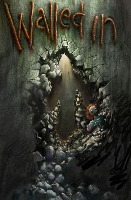
Directed by France's Gilles Paquet-Brenner (UV, Pretty Things) and starring the OC's very own Mischa Barton (The Sixth Sense, Notting Hill) alongside co-stars Deborah Kara Unger (Payback, Sunshine), and Cameron Bright (Thank You for Smoking, X-Men: The Last Stand), Walled In is based on the novel Les Emmurés by Sergio Brusolo, author of the 2003 sci-fi animated feature The Rain Children.
Walled In, the movie, follows engineering graduate Sam Walczak, a demolitions expert following in her family's footsteps. Sam is hired to supervise the demolition of a mysterious building, an estate constructed long ago by an infanous architect named Malestrazza, a man who intombed his residents within his building's walls. Sam's time inside Malestrazza's home begins to unveil unknown details of the architect’s life, and the long-forgotten secrets of his astonishing house.
Illustrated by the extremely talented Dennis Calero (Legion of Super-Heroes, Peter David's current run on X-Factor), the graphic novel explores the life of Malestrazza, prior to the motion picture. The book is scheduled for a summer 2008 release. The movie - which is in post-production - is expected the following fall.
An Absolute Atheist Looks at Christian Comic Books (Prelude)
Okay, here's the thing:
I've decided to read whole runs of Christian comic books.
Why?
Why not!
There's more out there than any non-Christian (or casual Christian) suspects, so this could be quite the ongoing blog topic for me. It'll only be in-between all my other reviews, articles, debates, soap-box diatribes, and unrepentant jeremiads, but there should be, I'd say, one per week. Likely, I'll branch out into comics that are embedded within other religions as well, though these aren't as prevalent, Mike Allred's 12-book adaptation of the Books of Mormon is the only thing I can think of off the top of my head. Maybe this is because other religions aren't as steeped in zealous recruiting techniques as Christians. Maybe I'll find an answer to this divide as I go.
Honestly? As a devout atheist, I have no idea what I'm getting into here. This is my version of the Amish "wild years", only in reverse - I'll delve into religious waters for a year or two, then see what I think at the end. Who knows? Maybe I'll get **cked in the head and turn, like a vampire.
Anywho, I'll be starting with one of the most successfully mainstream Christian books:
POWERMARK
This puppy was distributed through the holy grail (pun intended) of comic distributors, Diamond, which I think was a feat repeated only by the Christ-approved series Archangels: The Saga.
I'm starting with this one for a number of reasons:
1) It's vaguely super-heroish, meaning it should the most comparable to mainstream comics as a whole.
2) It's complete and has an end - the series ran for 24 issues, concluding it's story with the 24th. There's a second series (Powermark: Seeker Series) but the first did finish what it began, and that makes me feel it's accessible, more so than any other, and so a good place to start.
3) It's drawn by 90's Spider-man artist Steven Butler, who once upon a time was one of the absolute best. He was a favorite of mine back in high school, and this is where he disappeared to. So I'm curious on a personal level.
4) It's directly aimed at youth ages 8-14, the story of comic itself to bring youth back to Christianity. As I suspect all religious storytelling to be just this side of brainwashing (which all advertising is - I'm not claiming this to be a singularly religious conceit), Powermark may be the best book to start with, a mainstream package that looks alluring, even to me, aimed to convince people like me (albeit younger) to come "back to" or "over to" Christianity. This feels like a good ground zero for me to dissect and move to other books from, which may or may not be as accessible to the non-religious.
Okay, so I've got issue #1 in my hands. I'll hopefully have more to say on this within the week!
(Oh, man...what the hell am I doing...?)
TO BE CONTINUED...
REVIEW: Star Trek Alien Spotlight: Borg
Star Trek Alien Spotlight: Borg
Review by Dave Baxter, posted January 28, 2008

Words: Andrew Steven Harris
Pencils: Sean Murphy
Inks: Sean Murphy
Colors: Leonard O'Grady
Release Date: January 23, 2008
Publisher: IDW Publishing
Price: $3.99
My name officially rests on the IDW “comp list”, meaning I get a little package from them every few weeks, filled with comics to read and review. Often, the books are right up my alley, original GN’s or stand-alone minis, though on occasion something truly random arrives, most notably books that are a part of another brand-name universe I have never (or at least not in recent memory) kept up with. Thus was the case with Star Trek Alien Spotlight: Borg , a one shot taking place inside an ever-expanding franchise I’d never been a fervent follower of, my exposure limited to a smattering of Next Generation episodes and, of course, the entirety of the theatrically-released films. But here, lo, there be a Star Trek tale; it’d be fun, I thought, maybe even exciting, though it was a standard-sized one-shot cranked out by two creative types wholly unknown to me, so…best to keep my expectations in royal check.
Holy sufferin’ shaitan—twenty minutes later, as I lay the comic down measuredly, into my lap; as my eyes darted absent-mindedly about, witless, punch-drunk, completely suspicious that reality wasn’t, in fact, what I’d just witnessed it to be (it couldn’t be. I mean…it just couldn’t ); I thought to myself: it was. I read the issue again, just to be sure, and sure enough, it gave a repeat performance, which is to say…well…damn it, words fail. It was...really, really smart. That shouldn’t be such an implausible virtue, but it is. The story was supernaturally aware of the intricacies involved in each of its long-established characters, and was paced at a rare tempo, a rhythm that allowed for jaw-dropping, epic-as-epic-gets events to take place inside a comparably miniscule space without once, not for a single panel, reading as though anything beyond a clash of character philosophies.

Andrew Steven Harris is the man behind the brilliance, an editor for IDW’s Star Trek line, and like Roy Thomas back in the Marvel heyday of Conan, Harris not only knows his Trek, but he understands it as well, through-and-through, penning a tale as philosophically complex as any an Isaac Asimov Foundation novel, centered around mind-numbingly hard-SF conceits a la Primer, and speared through the middle with the terrifying threat of the ultimate Star Trek baddy—the Borg.
The story opens with a bang: a number of Federation ships obliterated, each at the precise moment they access their warp drives. Geordi LaForge is aboard one of the ships, and survives only by grace of his cybernetic implants part-assimilating a Borg infestation that then swarms throughout his body. Now, clued-in that the Borg are behind the inexplicable attacks, Admiral Janeway announces that the crisis is one long foreseen: the Borg are systematically moving backward through time, altering history into a perfectly Borg-triumphant one, the shockwave that precedes such a time distortion destabilizing all other attempts at similar warping of time and space.
To say that what comes next would ruin it…honestly? I don’t think it’s possible to summarize the story in any thoroughly understandable way. It’s intricate, and nuanced, and blasts through ideas and activity as though they were simply obstacles in the way of the comic itself. It’s as if Warren Ellis and Grant Morrison teamed up to write a Star Trek yarn only both having learned, somewhere down the line, how to write a story of honest-to-god sincerity . The wildness of Ellis and Morrison are here, as are their inordinate perception of plot and purpose, though Harris one-ups nearly every comic scribe alive by never missing a beat of authentic humanity, not for a single seqeuntial. There’s no empty posturing here, no unexplored avenues in favor of unnecessary conflict or misunderstandings or whatever the melodramatic cliché. This is a story that feels real. And it’s extraordinarily clever to boot.
If that weren’t enough of a heart-stopper, Harris is flanked by newcomer Sean Murphy, whose pages seethe with carefully construed power. The characters are the perfect balance  between cartoon caricatures and stand-alone comic designs. The faces of the famous folk: Picard, Geordi, Janeway, Data (to name but a few) are instantly recognizable, but they aren’t just facsimiles—they’re solid comic characters with a range of expression and posture and action. Murphy furthermore manages a thrilling number of near-cinematic suspense sequences, presenting the slow-burn drama of the events in a way that seems spontaneous, though such effect (which isn’t, in the end, an affect), is one of the most difficult things to generate in fiction.
What else can I say but…I’m flabbergasted. By the skill in which this one-shot was crafted and by the complete lack of reverberation it's made within the industry at large. This is a hallmark in comics, all comics, every comic; it’ll be criminally overlooked, especially as I fear that most reviewers, like me, although liable to praise the book for being a stunning surprise, will find themselves too busy being stunned to do more than muse quietly on how the book managed such pleasant impact. I don’t know if there’ll be a better single issue from any other comic book this year, even if we are only in January. There certainly wasn’t one last year.
No one’s likely to notice this one, but it is what it is, and what it is will stand, just like every falling tree will make one helluva sound, no matter who isn’t around to witness it.
REVIEW: Children of the Grave GN (Full Color Edition)
Children of the Grave GN (Full Color Edition)
Review by Dave Baxter, posted January 27, 2008

![]()
Words: Tom Waltz
Pencils: Casey Maloney
Inks: Casey Maloney
Colors: Jon Alderink
Publisher: IDW Publishing/Charlie Foxtrot Entertainment
Price: $19.99
When Children of the Grave first hit in 2003, a four-issue black-and-white mini from a new “publisher” (read: the writer) called Shooting Star Comics, it was met with a louder rumble of interest than most books receive after years of self-publication. The reason for the attention was self-evident: the art was good, which meant the ads were good (and the creators shelled out some serious cash to procure prominent placement inside Diamond’s Previews, month after month), and the subject matter was compelling—war in the Middle East spiced by an obvious though ingeniously undefined horror element, hinted at by both the zombie children sprinkled about the advertisements and, of course, the book’s title itself. Undead kids, war in an inhospitable land, an army unit of American protagonists…but…what exactly was it all about?
No one quite knew, but war and supernatural horror coupled by above-average art and a kick-ass title were enough to convince a small army of retailers to give the book a shot. Needless to say, the damn thing sold like hotcakes, at least for a black-and-white indy of the time, and both Waltz and Maloney were noticed by the industry at large. Fast forward to today and Waltz is now an editor at IDW Publishing, with Maloney still his co-patriot in crime on Gene Simmons’ Zipper and the occasional short showcased in the same imprint’s House of Horrors. What better way for IDW to celebrate the mainstream success of these two rising stars (now under their employ) than by giving their inaugural work a pro graphic novel collection? Well, one better way: give it a second, full color collection soon after!

In partnership with Charlie Foxtrot Entertainment—a new company dedicated to creating military fiction that honors and respects the spirit of the U.S. armed forces—Waltz and Maloney’s little self-published masterpiece is now saturated in glorious, foreboding, and haunting hues by CFE’s own Jon Alderink. This new edition also includes the never before collected eight-page short (Waltz and Maloney’s first collaboration) “Ghosts of the Past”, starring the super-powered vigilante Catalyst, a costumed man with a veteran’s past. Between this and the main story looking more eye-catching than ever, Children of the Grave is well worth the repeat purchase. Just look for the incredibly apt Ashley Wood cover and you’ll know you’re gripping the right one.
Though what about the story itself? Tom Waltz is a writer in the same camp (and situation) as Christos N. Gage, Keith Giffen, and Beau Smith; he’s a phenomenal writer, but not flashy, rarely ever controversial, and therefore forever underrated. His plotting is natural, and in that sense, unpredictable. Characters and actions move to the beat of the needs of the characters and the story’s elements. There’s never a feeling that it all gets away from Waltz, but neither does it feel constrained or contrived. Even more impressive, he’s is one of the very, very few number of living individuals that can write a serious, contemporary war comic and not have it sound cliché, pat, or outright silly.
There are writers skilled in crafting blackly humorous war stories (Garth Ennis), or the period war fable (Ennis again, and Jason Aaron), and there’re uncountable number of campier, old-school flavored war comics like G.I. Joe, Specwar, Lost Squad, and G.I. Spy. But few can write a straight-up, real life war story with believable characters, believable events, and even toss in unbelievable ingredients and yet have such surrealism enhance the solemnity of the story’s core. The horror in Children of the Grave is real; but it’s small; but it’s also essential. The characters on both side of the battle’s divide are treated with an intelligent care, and yet the story is still largely and adventurous one, high in action and high in dramatic effect.
The breakdown: a three-man U.S. army unit is sent to investigate rumors that one Colonel Akbar Assan, a ruthless Stinwanese military leader, has been murdering Kilwanese children en masse. But the Americans find only empty child-sized graves, though this bizarre find is sufficient, it seems, for the U.S. brass to send new orders: find and assassinate the Colonel. What follows is a slow and almost Western-style movement through desert landscapes, gunfights and moments of unreal horror abounding. Though the book is far from slow. It’s difficult to describe Waltz’s unique blend of careful character study and pulp friction-fast activity without it sounding contradictory, but somehow, Waltz does utilize both, and he does it well.
For example, in one scene near the end, one of the three American soldiers has an at-length conversation with his dead mother—a dense, tug-at-the-ol’-heartstrings bit—and then he leaps from out behind his makeshift cover, a gun in each hand blazing, and shouts: “For my mama you mother f***ers!” That’s about as classic an 80’s action-hero line as it gets, but it works. That moment is, by and large, worth the price of admission alone.
And lest I get too caught up in super-sizing Waltz’s ego, the art by Casey Maloney, still today, after all these years, stands as extraordinary, especially for what was originally an independent release. The characters are tough-as-nails, natural heroes and villains, while maintaining a sincere humanity rarely encountered inside comics. The details are real, the expressions, the body language, the composition (again I refer to the “For my mama you…!” moment, as Maloney’s rendition of it is exquisite). The horror is properly disturbing and the soft-spoken moments nuanced. To put it succinctly, he’s a gifted man, and he manages Waltz’s scripts gorgeously.
This full-color Children of the Grave graphic novel is just the first IDW/Charlie Foxtrot team-up, with two more original GN’s to come: Finding Peace and City of Fire. If either of those is half what Children proved to be, CFE may just become the mainstream military-focused entertainment group we thought we’d never actually see: a trustworthy, high-quality one. I know I’ll be keeping my eye on them after this.
One More Brand New Day - Revisited
Definitely check out the full article (click on the underlined link) below, if you have the time, but if not, here's a highlight taken for my own purposes.
Stolen from the (vastly) longer article "The past is prelude, the plot is progress" byTom Bondurant:
"I’m not going to get too much farther into the briar patch of altered continuity. My question today is, when should an explanatory story arc be published? In other words, when do you need to explain? The answer for the Big Two seems to be that, in order to preserve the macro-narrative (and especially the sense that things are happening as we speak), these events must all proceed in regular sequence. “One More Day” is the prerequisite for “Brand New Day,” and Final Crisis requires Countdown. The story matters less than the fact that there is a story, even if that story is just a setup for the real story. "
This makes a pretty ingenious (that's genius, not genuous) point. The mere presence of a story, or even of an element or series of elements within a story, isn't a justification for all that comes after said story or elements. There's a difference between understanding the need for a generalized thing and the proper implementation thereof. Editors are usually good at understanding a serialized publication's broad requirements, whereas writers are hired to be the authorities on a series' blow-by-blow story beats. Unfortunately, editors tend to dictate more than they should, and writers tend to believe that fulfilling an editor's generalized requirement is the same as absorbing it into their actual writing. The presence of a father's decaying corpse, or even a father's preternaturally preserved corpse, is not the same as having a dear loved family member as living and part of your life. Same goes for story elements and stories, or, in Bondurant's claim, stories and stories.
Though where Bondurant expresses a desire for publishers to just jump over a hurdle to any desired story without "explanatory" sales-machines to get us there, I'd venture to point out that that's precisely where "The Clone Saga" and "Sword of Atlantis" came from. "Sword" managed some wonderful stories, but the niggling concept that Arthur and the events of the past eventually needed to be address was always present, and ruined the concept as a long-running thing. Additionally, I'd point out that the rest of "One Year Later" (Bondurant's choice example to show how skipping over the "event" allows for natural story flow) was by-and-large an abysmal affair, giving standard-fare stories without, again, addressing what eventually would need to be addressed. It creates an unspoken tension/conflict between reader and a creative property. The reader won't relax until he or she knows. The editors won't relax until the readers relax. When the big reveal eventually comes, it's forever too little too late, and its arbitrariness is palpable as no one had an answer to the continuity questions in the first place, and only later scrambled to make things work best as they can a la "Clone War" and Tad Williams' post-"Sword" Aquaman.
Why not just tell a linear story? No event, and if there's a big thing to occur, let it occur, not to get somewhere, but because it's a good, linear story that maintains the series' integrity. Any argument that such a thing can't be done is (as I argued in my last post) self-fulfilling, and not really supportable. Show me a comic with linear integrity (however it's executed) and character integrity to boot, and I'll show you the masterpieces of modern comicdom.
One More Brand New Day - Pulping Comics
So on the topic of the Spider-Man stories "ONE MORE DAY" and "BRAND NEW DAY", wherein Peter Parker's marriage with Mary Jane Watson Parker is annulled by Mephisto, the devil, Peter and she bargaining to save Aunt May's life in exchange for wiping their marriage out of reality. That's a marriage wiped out to save the life of an 80 year old woman.
What follows is a completely clean slate continuity as the erased marriage spontaneously gestates a completely different Spider-Man history in pupal form, which is opened and explored in "Brand New Day", a "fresh start" that "allows" for fun and freewheeling old-school stories to be told once again, no longer "bogged down" by "aged" characters with lives that resemble, even minutely, life.
One guy on a message board wrote, in defense of BND:
So yeah, well it doesn't bother me, I could see how these stories might upset older fans. But if it's been thirty years since the actual issue came out, I'm more inclined to think people would look on the new direction with nostalgia.
The problem is that it shouldn't be an issue of choosing sides. There shouldn't be a divide between old fans and new fans in the storytellers/editors eyes. Is there really no good Spider-Man story that doesn't rehash the past? Sure, the newer fans will never know, and older fans might be nostalgic about it, but why do a thing that's a) obviously unfaithful to everything already established, b) runs the risk of unnecessarily alienating any part of a readership (note the "unnecessarily" part of that statement, meaning anything already PROVEN time and again to alienate), and c) is the embodiment of a bad cliché in an already frowned-upon medium, frowned-upon for cultivating just such clichés?
Could Spider-Man stories really not be fun and old-school melodramatic without ending a marriage and erasing decades of continuity in order to establish some arbitrary new history which is still, for all intents and purposes, "continuity", only now fans don't know what the hell it is and so everyone on the creative side has an "out" to do whatever they please, at least until enough new continuity is established at which point Mephisto (or some other diabolus ex machina) will just have to come back and do it all over again, because "it's just not possible" to write good stories with any sort of (heaven forefend!) restrictions, like, you know, established character, and actual points of...what the hell is that thing called again? Oh right: plot.
Spider-Man is a professionally published book, with skilled professionals at the helm, both editorially and creatively. The fact that "no writer could write the marriage convincingly" is bizarre. How many writers outside of comics do you think can't write a convincing marriage? Not many, because think how limiting that would make the possible stories they could tell. It's a self-fulfilling prophecy: it doesn't work, we can't do it, we have to reboot, start over, the only way to tell a good Spider-Man story is to have nothing to care about all over again! It's like an arbitrarily selected religion, a decision made and never doubted again, but that doesn't make it god's own truth, that just makes it a religion, sycophantic bull-caca that says there's only one answer, one truth, one way, and everyone else is damn well damned. Screw that.
BRAND NEW DAY claims to be something it's not: a brand new day, and also, good storytelling. Nothing that rewrites or ignores good storytelling practices in order to be good storytelling, can in fact be called good storytelling. That's ridiculous. I understand any dude or dudette off the street can pick up BND and like it, knowing little or nothing about the "controversy" surrounding its existence, but let's be honest here: bad storytelling isn't effing controversial. It's prevalent, it's the norm, and the fact that a good story could "only" come out of bad storytelling is an arbitrary choice on Marvel's part and a poor one. They could have done this professionally, with integrity, with intelligence, consideration, and - most importantly - SKILL. Yes, it would take talent to write a good Spider-Man story without altering the material to suit personal whims. It takes exceedingly minimal talent to write from a blank slate, with a built-in fanbase, a built-in flavor, and apparently even built-in plot points stolen from out of the past. Sure, it won't bother everyone, but why the HELL would you do it if it could be done in other ways, ways that would be respected and treasured rather than scorned or (at best, with the people that even like BND) shrugged-off or ignored?
Everything good in BND could have been good without - no, not OMD, but without BND. This story of Slott's could have been by-and-large TOLD and told well without any of it. Especially the parts that are actually resonant, or fun, or thrilling. In fact, nearly every virtue of BND that Sal extols has, of course, nothing whatsoever to do with OMD or BND, but is just a part of a fun Spider-Man story, that could exist with MJ still present as wife, all characters and continuity points right where we left it, maybe just Peter's identity needing to be secret again, which could have been fixed with a fun and dramatic, clever little story. Any plot point is possible and possible to do well and while maintaining the integrity of what has come before and therefore the integrity of the actual creators.
This? And things like OMD and BND? It's not necessary. And everything in existence has good points, so of course there will be things to enjoy about OMD and BND, no matter what. Just because fun/interesting things are present doesn't mean you have to support a thing in order to support its good bits as though the simple fact of having good bits was by itself worth supporting. And supporting a thing is supporting a thing. If you do it, then you're doing it. You're all free thinking individuals, able to ignore AMAZING SPIDER-MAN or ignore me for the rest of your lives if need be, and be richer for it either way. It's called addiction and obsession to do otherwise. Though it's no surprise we comic buyers are afflicted by both, to our core. Money-making potential in Hollywood aside, we’re not a respected medium precisely because we support this kind of s***. Actual comic books still don’t turn a profit, hardly a one. This, literally, is the only thing holding us back anymore, so my patience with it is done, as should be (I suspect) anyone who wants to see the medium survive and not fade away like the pulps, which even in its resurgence of popularity today, we’re not exactly seeing actual pulp magazines again, just a series of homages. The pulps died because they refused to change. So too will comics, if they don’t.

Robert McKee Say: Shut Up and Write Like ME
A really good quote from Robert McKee's book STORY:
(WAIT! Before we get to the quote, quick caveat: I don't usually cite crappola from books on writing, as I don't believe there are absolute answers or how-to's in crafting a good, polished story, but I do believe in certain generalities of human behavior and self-delusion, and this one hits home. Way home. Oh-so-uncomfortably so. If this quote doesn't make you nod in agreement and squirm in consternation - at the same time - you're probably one of the delusional. To wit:)
"As for technique, what the novice writer mistakes for craft is simply his unconscious absorption of story elements from every novel, film or play he's ever encountered. As he writes, he matches his work by trial and error against a model built up from accumulated reading and watching. The unschooled writer calls this "instinct," but it is merely habit and it's rigidly limiting. He either imitates his mental prototype or imagines himself in the avant-garde and rebels against it. But the haphazard groping toward or revolt against the sum of unconsciously imagined repetitions is not, in any real sense, technique, and leads to screenplays clogged with clichés of either the commercial or art house variety."
Now this, of course, leaves out the possibility of a fledgling writer honestly coming across something unique and powerful that nevertheless defies most of modern technique, as well as (and in support of that last point) the fact that "technique" is a highly time-sensitive word in definition. Most of what we call "technique" is, at any given time, due to the greater part of our culture retaining the past learning of its leaders in any particular field, and therefore it is, absolutely, arguable that modern technique naturally rivals all past technique, in both form and effect. Though while that may be true, only in some of its ways would I say it is thus. In others, technique of any time period is as much a fashion or zeitgeist as actual fashions, though these aspects can usually be determined by their historically cyclical comings and goings, in today, out tomorrow, in again come tomorrow's tomorrow, etc.
So what Robert Mckee say is true, but it isn't unanimously so. That means yes, your rejected "masterpiece" may be allowed to be called such a thing without quotations. But it also means that that isn't bloody well likely. What it means without exception is: don't justify, because justification exposes your work's amateur roots and inefficient attempts at homage thereof. If your work needs justification, it's not what you think it is, or rather, it's precisely what you think it is, but it's nothing more. It's a poor substitute of Alan Moore, or William S. Burroughs, or Stephen King, if all you do think of it is that it's "the next Alan Moore" or "the modern Stephen King". Aping isn't technique-ing, and there's always an example of someone, somewhere, doing something exceedingly well that few if anyone else can handle with equal panache. So the question isn't who else sounds like you (and easy thing to find a fit for), the question is: do you actually sound like them?
The Future of Comis is...uh...in the Future. VERY in the Future.
D2Comics Digital Comics Digitally Debut
Lowdown by Dave Baxter, posted January 20, 2008
D2Comics claims their new product—digital video comics—to be “the evolution of comics”. And they just might be, though as we all know, evolution is a long, loooooong process.
What precisely are “digital video comics”? The first thing the phrase brings to mind are  preview “trailers” for upcoming comics, those videos that populate the Big Two webspaces and the more universal sites like YouTube and Vimeo. These tend to be intriguing little ditties, though little else besides: they splice together static images, panels and promotional pin-ups that scroll and shake and zoom about, accompanied by music tracks and folied-in sound SFX. Personally (being a touch dated, like balsamic vinaigrette), I thought of Crossgen’s 2003 DVD compilations, discs that offered six or seven issues of their then-current titles, which, in CG’s own words, brought “comic books to life with amazing voice-overs…and colorful images!”
In both cases, the DVDs and the trailers, there are things to love and things to shrug about. Trailers are meant to entice, to give a hint of flavor and rouse a little excitement for an upcoming or otherwise unknown work. But due to the nature of the static image and the moving image, the fact that comic book images are crafted and meant to flow in a particular sequential way, while motion pictures are crafted to inform via fluid action, the trailers are only worthwhile as dressing. If they try to be a salad, to offer details and blow-by-blow action of a story, they prove less than captivating.
The Crossgen DVDs however did strive to tell an entire comic book epic, via cleverly cropped artwork, a little flash-style animation, and a thoroughly voiceover/acted script. It was surprisingly well-done, especially for the times (and in comparison to all other attempts at similar gimmickry), but ultimately, as readers unanimously read the comics first, long before looking at the DVDs, it’s difficult to call it anything else—a gimmick.
Now, five years into the far-flung future, and what do “digital video comics” offer that neither trailers nor the failed DVD/CD digital comics of the early 2000’s did? Yeah, therein lay the rub of this particular tragedy.
What Digital Video Comics (DVCs) Are and Offer
They’re downloadable videos accompanied by the specific software necessary to view them. Included with each is an approximately 15-20 minute video that comprises one-to-two issues of comic book material in trailer-like form, with an original soundtrack, animations, and sound effects, though unlike the Crossgen DVDs, these have no voiceovers or actors, only effects with the occasional “ahhh!” and “ugh!” thrown in for a little zing. Also included are commentary by the creators, live interviews, and behind-the-scene featurettes, just as found on any major movie DVD.
A quick Google search will bring up a list of vendors that sell D2Comics’ DVCs for direct download, though the premiere retailer is Direct2Drive, selling each title at $2.99 a pop or $9.99 for the complete bundle of currently available titles. After purchasing and subsequently downloading (make sure you’ve got some mother-lovin’ space, too—each video is 150-300MB!), an installation of the program is required, and then an unzipping of the video itself (so, technically, you’ll need double the available memory, as you’ll have to, at least momentarily, hold both the zipped and unzipped versions on your hard drive concomitantly). Then let ‘er rip and a menu pops up, sweetly designed like every DVD menu known to man, and therefore intuitive; extras available with one click, the video itself with another, a relatively easy control set-up throughout.
What Comics Are D2Comics?


In two words: Steve Niles.
In five: Steve Niles and Thomas Jane. Currently, D2Comics has released nothing but creator-owned Niles books, including those co-created by superstar Tom Jane: Bad Planet, Alien Pig Farm 3000, Strange Cases, and The Cryptics are the current sum total. That’s a nifty selection, and at the offset, they seem an honest match; Niles’ books are highly cinematic, decompressed, already a movie shown in stills rather than anything more fitting to old-school sequential style. So how do these movie-like books fare as digital videos?

I hadn’t yet read any of the actual comics, so I went ahead and kept it that way, at least initially. I watched the DVCs first, so as to have zero expectations, and then I read the comics immediately thereafter, for perspective. Here’s how they held up:
Alien Pig Farm 3000
With a bluesgrass banjo-harmonica-fiddle score and a fast-paced, irreverent plot, APF was definitely fun to watch, although it ended far too soon, on a cliffhanger and with very little having yet occurred. I found out when I turned to the actual comic that the video comprised the events of both issue #1 and issue #2 of the four-issue mini, which was baffling. Talk about decompressed storytelling! This was my first clue that the other side to Niles’ “cinematic flair” coin was actually a weakness—an overall character-lite and event-lite story.
The makers of the DVC managed a few skillful touches here and there, though overall the video controlled the action, allowing it to flow only at the pace it wanted, showing one panel and then the next, though not until it was good and ready. This proved damn frustrating; I never thought about how personal the flow of a comic was to any individual reader. No matter how dynamic a page’s layout, it’s every man or woman’s own speed that determines how the panels and moments fit together in their eyes and minds. So when that very freedom is wrestled away, the whole experience turns exceedingly lackluster, regardless of the video’s attempts to spice up what amounts to a frill-less slideshow of your grandparents’ trip to a comic book museum.

When I read the printed comic after, I found the flow of the story much more precise, moments the video cut out (sometimes no more than a single panel) fleshing out the action, the characters, and the pace into something much more natural and, frankly, artful. I went back and looked over the Crossgen DVDs (yes, I still own them) and found that they adhered to the original art and layout of the comics they showcased, whereas the D2Comics editions were selective in which moments and panels to use. APF 3000 wasn’t, I would soon learn, the worst offender in this, but already it was a noticeable flaw.

Another major issue: the art by Don Marquez, while tight in the comic, didn’t translate into blown-up, zoomed-in panels that stretched across an entire computer screen. Even minimizing the screen to its smallest size (and you can’t go too small, because there’s no voice acting, so it’s important to keep the text readable), the art still seemed overly elongated and, comparatively, when I read the comic itself, not even in the same ballpark of beauty. Even worse, once again when I went back to the Crossgen DVDs, the art there, on a television screen bigger than my computer screen, held up magnificently. Hmmm.
As for the extras, now here ’s where things got worthwhile. Thomas Jane, Todd Farmer, and Don Marquez sit and shoot the poop for twenty plus minutes, totally at random, just talking, talking, talking, which was very cool. On the down side, Jane seemed drunk as a skunk throughout the whole thing (though perhaps that’s a plus, depends on the person and how entertained by a drunk Tom Jane they’d be—it gets old after a while, but initially his behavior fascinates), and nothing of particular merit was discussed. It was like a non-interactive panel at a big convention: informative in very vague ways, but hardly necessary and not what one would call engaging.
Bad Planet
A much more thrilling story, and maybe (I thought) a more suitable vibe to its sci-fi subject matter for a video version.
Whoof. Nope. The story seemed wholly unmoving, stuck at maximum drama, the music score forever swelling in perpetual crescendo, screams every other panel, stock sound effects of mass destruction. It was epic in scope, to be sure, but in the realm of the motion picture, it seemed…tired. Bad Planet was a very movie-like comic, but saying something is “a very movie-like movie” just isn’t a compliment. I discovered later that the video near-completely ignored the first issue of BP, leaping right into the opening of issue #2, starting at the beginning of the invasion of Earth, then backtracking slightly to establish a few characters before charging ahead. The video ends around the end of issue #2, but all the set-up, all the actual characters and story beats that weren’t sheer destruction and terror from issue #1, just…missing.

Bradstreet and Larosa provide the art in BD, and it’s what the series’ rep truly stems from. Dark, majestic, detailed, did I mention dark? It’s beautiful. In the comic. Blown up for the video? It’s just this side of unwatchable, appearing flimsy and unattended. I don’t know how anyone can make Bradstreet look rushed and ill-considered, but somehow, D2Comics has made it happen, and knowing about fractal digital imaging and the complete un-necessity of allowing such a thing to happen, that’s just plumb criminal, and the worst of D2Comic’s sins (and if they are using fractals, this whole concept may just need to wait for better technology).

On the extras front: same awesome if bizarre things apply. Tom Jane is still, apparently, toasted.
Strange Cases
This was the sweet surprise of the bunch, not simply because it was selected, but because it was good. The tone and flavor suit the presentational style of a DVC far better than the more violent, action-oriented epics of Alien Pig Farm and Bad Planet. Strange Cases being a more whimsical (if only fractionally less deadly), episodic ongoing, it wields a television-pilot friendly pitch: a group of monster hunters invited to the mansion of a mysterious benefactor, to be assigned a nigh-impossible (though well-paid) tasking. It’s a conceit that lends itself to shorter, self-contained shorts, and so it’s the first DVC, unlike those of the previous two series, to stand alone as a complete origin story.

Even better, the art by David Hartman is naturally looser, heavy ink over left-behind pencil sketches, the final product thus proving impressive when zoomed in upon for close inspection. The humor of the book works with the pacing and the chosen motion of the visuals’ movement. Even the extras attached to this one are illuminating and fun without falling into the awkward, almost voyeuristic territory of watching Tom Jane act uncanny for fifteen minutes straight.

I discovered (when I turned to the actual comic) that Strange Cases was the lone lad of the initial D2Comics lot that was created, from the ground floor, to be a “multi-format collaboration with D2Comics”, or, in other words, it was made specifically with the DVC format in mind as well as traditional print formats. It shows.
The Cryptics
After the wonderful surprise that was Strange Cases, I predicted The Cryptics to be a book that’d prove equally as excellent, its art by Ben Roman from the same school as Hartman’s (and even more stylized, in fact), humor its central spice, the episodes even shorter and more succinct, being a collection of almost strip-sized short-shorts. Sadly, it seems the balance of factors that make a good DVC is a finely-tuned thing indeed.
Roman’s art does come across in the DVC format better than Bradstreet’s or Marquez’s, but his usually crystal-clear animation-style lines of blur under the magnification, and prove less impressive than they normally do. Additionally, the humor of the comic depends entirely on its visual timing, and the timing outright fails when the panel-to-panel motion is slower than instantaneous. Any pan, or slide, or scroll, and the humor falls flat. The Cryptics DVC does make a commendable argument that the property itself might make a brilliant animated short or feature, but as a static-image video, a sort of half-way thing between the two…not so much.

Commentary by Roman and Niles is good, though. Nothing that’ll blow your mind or truly illuminate, but it’s lucid and good-natured and hey, you get to see the creators and hear them blah blah blah. That’s always worth watching.
And so…
If this is the evolution of comics, it’s nothing but a beginning, a first freak mutation that may or may not grow into anything that ultimately even resembles its origins, but sure, it may be the first sign of a change nevertheless.
The big problem is that DVCs aren’t very groundbreaking or new in their own right; they are, at best, bastard children of past comics-on-DVDs and comics-on-CDs, the video equivalent of digital-art comics of the 80’s, something that’ll hardly appear impressive past its fifteen minutes of prime-time fame, a thing exceedingly of its time, destined to be sniggered at and have older folks, fifteen years later, place a hand to their cheek and moan: “Oh, man, I used to love those things…can you believe it?”.
If you feel like giving the property a try, I highly recommend D2Comics’ Strange Cases, and to D2Comics I can only say: look into establishing properties made for the DVC format like SC, and let go of those books that aren’t tailor made to become panel-by-panel videos, otherwise the art becomes purely second-rate. Comics and videos are visual mediums, and if the visuals aren’t up to snuff, the point is automatically moot.
Mini-Reviews: A Decent YOUNGBLOOD?!? Really?
Thought I'd share these few mini-reviews, especially the Youngblood one, because I'm still picking my jaw off the floor after reading a good Youngblood book!
Fast Breaks for 1/09
posted on  January 15, 2008

Cory Doctorow’s Futuristic Tales of the Here and Now #4: Nimby and the D-Hoppers
By Dave Baxter
Yet another fantastic installment in what’s proving a necessary new series, a booster-shot of literary finesse in an otherwise staling world of sci-fi comics, Nimby and the D-Hoppers is the weakest of the four Tales thus far, yet still it makes for an unforgettable read. The premise: in much the same theoretical way in which the first time machine should unleash an uncontrollable barrage of time travelers among us, so too does Nimby follow the invention of a trans-dimensional suit and the dimension-hopping chaos that ensues.
The most memorable aspect of the story also proves its greatest weakness - too much too fast, idea after idea after idea, until the deluge overpowers. This may be a fault of the adaptation or the original prose story itself (I can’t say, being unfamiliar with the source material), but either way, scripter Dan Taylor (Super Hero Happy Hour) isn’t able to bring the elements into clear enough view. There’s a world of "refuseniks", living in a purely organic/biological town of seed-grown buildings and a technology-free environment, plus multiple dimensions, multiple versions of different characters, a lot of hinted-at politics, and oh so much more. My gut says the prose story may have made more sense, having more time to introduce and develop the pieces, but what Taylor does manage to showcase is well handled, definitely exciting, and followable in at least a general sense.
Taylor’s usual partner-in-crime Dustin Evans handles the art, and while I’m pleased as punch to see him here he may not have been the strongest choice. His style leaves a mark, and his pages in Nimby are a package I won’t soon forget, but the complexities of the story could have been strengthened by a more detailed, cleaner sensibility. All in all though, a highly worthwhile issue to a series collecting some mind-opening work by a leading author in the literary field.
Dan Taylor (W), Dustin Evans (P), Dustin Evans (I), IDW Publishing, $3.99

Gene Simmons’ Dominatrix #6
By Dave Baxter
The first story arc comes to a close, the wrap-up of Dominique’s origin, in which she and her nemesis, Happy Jacq - recently revealed to be an alter ego of the homeless girl named BJ (the sexual subtlety here being non-existent) - duke it out in a no-holds-barred throwdown; a battle of two super-tough women that ends in a singular tragedy, which in turn leads to Dominique’s ongoing status quo.
Color me impressed: Dominatrix consistently surprises, shattering all expectations (or complete lack thereof) by putting forth entertaining issue after entertaining issue. There’s nothing extraordinary here, nothing boundary-breaking though it can be occasionally be thought-provoking, but what writer Sean Taylor and artist Esteve Polls truly succeed at is penning an unpredictable and disarmingly charming comic book pulp adventure, the likes of which hasn’t, honestly, been seen in quite a while. The innocence of its flavor mixed with a constant salvo of severe themes (death, sex, conspiracy, derring-do) makes Dominatrix the pulpiest pulp on the stands today, capturing, oddly, the authentic sensibilities of that old-school style.
Taylor’s script is sometimes awkward, though his pacing keeps things captivating. Polls’ pencils are detailed and classic, reminiscent of Steve Leiber (Whiteout). This final chapter offers one big action sequence followed by a believable series of consequences that set-up the conceit for the rest on the ongoing. A strong finish to a strong start to what will hopefully be a series that, in the spirit of its title subject matter, never weakens.
Sean Taylor (W), Esteve Polls (P), Esteve Polls (I), IDW Publishing, $3.99

Youngblood #1
By Dave Baxter
Well…it’s about goddamn time somebody wrote a decent Youngblood book. Even better, Joe Casey writes an utterly, flabbergastingly perfect Youngblood book! Think of a much more lucid Automatic Kafka or a completely non-homage-laden Gødland and Casey is at the tip-top of his game. Seriously, this may be the best book he’s ever written, and that is surely saying something.
The team returns, though only a few: Shaft, Badrock, Cougar, Die Hard, Doc Rocket, and Johnny Panic. Suddenly manageable in numbers, the book also at long last finds a focus: a new team balancing the need to be constantly chronicled celebrities and authentic, effective super-heroes. That shtick’s been done before, visited in Noble Causes, New Warriors (Volume 3), Wild Guard, amongst others, but those have been more fanciful, tongue-in-cheek, or the celebrity status part a mere piece of a larger conceit. None have handled the media/super-hero dichotomy as intelligently, carefully, or as thoroughly as witnessed in Casey’s Youngblood. And yes, there’s even plenty of action to keep old-school fans glutted.
The art by Derec Donovan allows the series to "click", to work as a final product - it’s everything Leifield’s work is not: contained, delicate, nuanced, expressive. The density of Casey’s script translates entirely via Donovan’s layouts and lines, and the end result is a Youngblood book that looks like it’ll last, the real deal, an ongoing that will indeed go on beyond this opening chapter. A perfect Youngblood, a near-perfect comic; this is a hell-has-frozen-over moment in comic book history, to be outdone only by a dramatic change that is never changed back. I cannot wait for Casey’s re-scripting of the original mini now; I am officially, for the first time ever, a loud and proud super-supporter of Image’s founding flagship title—more Youngblood, please!
Joe Casey (W), Derec Donovan (P), Derec Donovan (I), Image Comics, $2.99
Cemetery Blues #1
Let's kick this blog off in grand fashion, with a review for the best comic of the week of 1/16/08 - to wit:
As always, this is as posted on
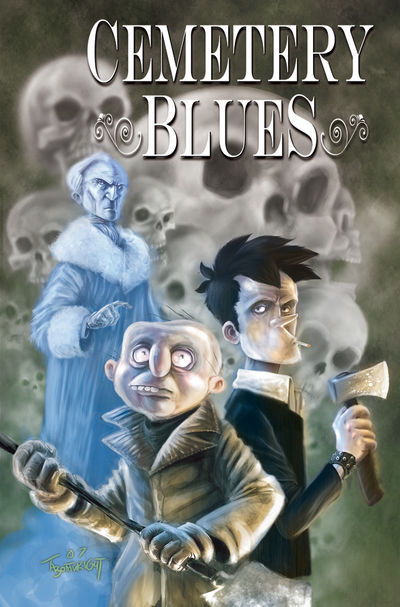
Cemetery Blues #1
Writer: Ryan Rubio
Artist: Thomas Boatwright
Storyline: The Haunting of Hernesburg, Part 1 of 3
Publisher: Image/Shadowline
Price: $3.50
“The Curse of Wallace Manor”, a three-issue mini that started the Cemetery Blues cult fan-following, was a scandalously well put-together blend of the eerie and the oddball, desert-dry British humor peppered with honest supernatural terrors. Typically, such comics—fun though they might be—are either simple action-packed shorts or all-ages fare, but "Wallace Manor" managed to capture the strengths of both styles, melding them into something only a handful of books ever achieve: an epic intensity that doesn’t sacrifice its more lively elements. Though while “Wallace Manor” proved a memorable series, “The Haunting of Hernesburg” from Shadowline/Image, is something even better.
Monster hunters Mortimer Ridley and Falstaff—a sort of UK Abbott and Costello (if Abbott were John Constantine and Costello Quasimodo)—journey to the town of Hernesburg, led by their spirit-mentor, Mr. Lear, on the path of a vampire outbreak. In inimitable bungling fashion, the duo traipse onto a funeral ceremony, hoping to stake a coffin’s occupant (he likely being an undead bugger, or so they assume). But more is going on in Hernesburg than meets the eye, and soon the village’s menfolk alongside the local clergy conspire to lull these “skilled monster hunters” into helping them hunt an evil that haunts the village. Our pseudo-heroes agree, but in the shadows lurks none other than the powerful warlock Orlok, the arch-nemesis of said spirit-mentor Lear.
So what’s going on in Hernesburg? Why does Orlok care about the place? That’s the mystery at the core of “Haunting”, though the point of the book isn’t so much the solving of an intricate puzzle (as anyone who spots a particular root in the town’s name already has a pretty good guess as to what’s going on) but rather, in the spirit of Bone and Boneyard , it’s to see how an extensive cast of ludicrous characters move the plot elements to play out.
The story of “Haunting” is assured, a multi-layered weave as compared to its predecessor, “The Curse of Wallace Manor”. Writer Ryan Rubio allows himself a greater range of dialogue and character interplay, a more intuitive and less formulaic ebb and flow of comedy and violence, dramatic heft and non-sequiter parody, his script of “Hernesburg” closer to jazz while “Wallace Manor” flowed more like standard rock. His growing confidence as a writer is apparent here, with a larger cast and story, also his deft handling of British-style syntax and wordplay. The dialogue in CB rivals that of most Hellblazer issues, even the ones handled by authentic Brits, as the Vertigo series tends to strive for an artificial level of colloquialisms and curses while CB manages something closer to a textual Victorian aesthetic, its flavor closer to Gothic than urban and allowing for a more natural read.

But for all Rubio’s growing flair, he still needs a large dose of grit and modern-day snark for this horror comedy to succeed, and that’s where artist Thomas Boatwright comes in. Hot on the heels of The Surreal Adventures of Edgar Allan Poo , Boatwright turns his lush fantasy colors into what will soon become the standard for black-and-white books. I don’t know if he colored the pages of CB #1 and then knew of a way to artfully translate them, or if he just plumb knows how to handle grey scale the way a colorist knows his hues, but Cemetery Blues #1 showcases an extraordinary thing: a B&W comic as intricate and eye-catching as anything in color. His explosion of grey tones moves CB into the realm of the grandly grim and Gothic, and his characters are expressive, in body and face alike, his comedic timing spot on.
“The Haunting of Hernesberg” is candy for the eye, hysteria for the soul, highlighted by serious thrills to exercise the heart, and crazy-ass ideas to spark the imagination. It’s Fear Agent for the horror comics crowd, and it’s godawfully good at what it does. If you’re in any way undecided on whether or not to give this series the time of day, it’s only because you haven’t seen this. Seriously, if you can resist that , then you’re reading in the wrong medium.
###
If you’d like to give the original self-published mini a shot, contact the creators via their website: http://www.sequentialmatinee.com/. Issues #1 and #2 are available at ComiXpress, though the third and final has never officially been published, so drop Ryan and Thomas a line and they’ll be happy to get a copy of out to you.
And check out “The Haunting of Hernesburg” preview at newsarama